

"We were considering demolishing our house"
Better results at a fraction of the cost.
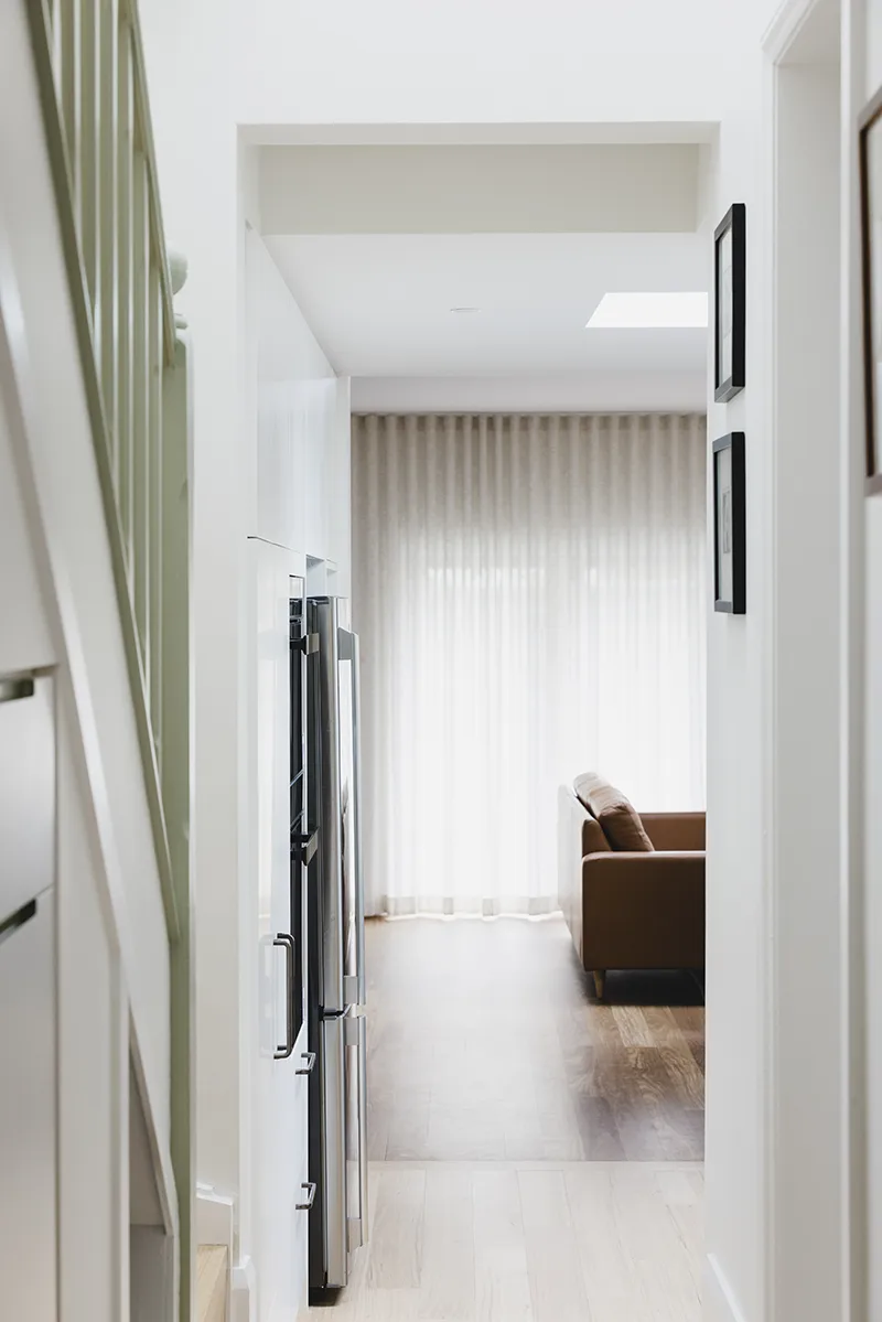
Thoughtful joinery, improved flow and carefully planned storage transformed this dark terrace into a calm and functional forever home for a young family — without demolition.
The clients originally considered knocking down and rebuilding their Newtown terrace, unhappy with its dark, boxy layout and lack of storage. Although the house had already been extended, the living spaces still felt cluttered, disconnected and impractical for family life with two young children. This project became a great example of how thoughtful joinery and smart planning can completely transform a home without major structural work.
Design Brief
The main priorities were to improve storage, circulation and natural light across the kitchen, living areas, hallway and children’s bedroom.
In the living room, the clients wanted flexible joinery that could conceal daily clutter and create dedicated zones for study, music practice and family living. The kitchen was dated and needed better storage, updated appliances and a warmer feel. The access to the living areas through the kitchen was very tight. The laundry was already in the hallway, but stole a large portion of the entrance area. The whole entrance required smarter storage and a more welcoming feel. Lastly, the children’s bedroom needed to comfortably fit two separate beds alongside storage and play space.

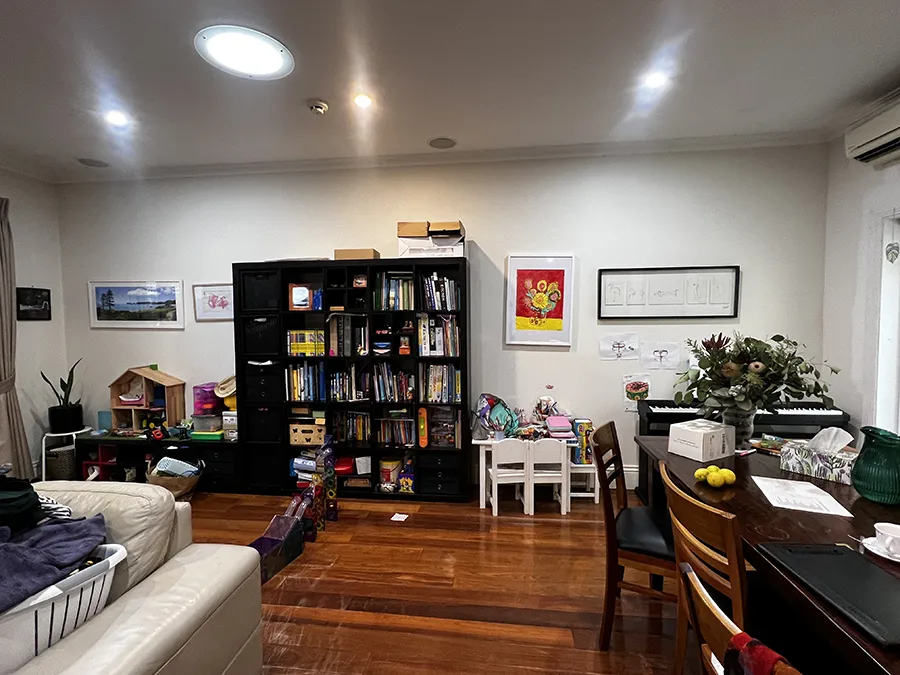
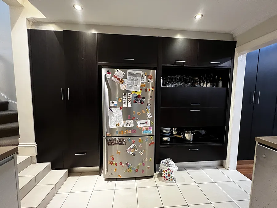
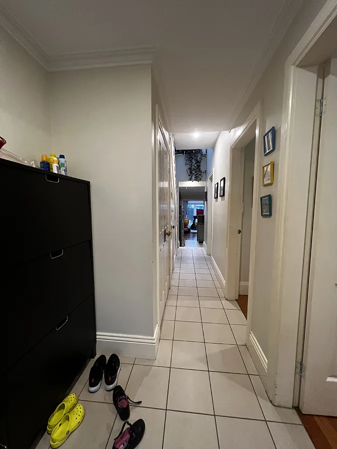
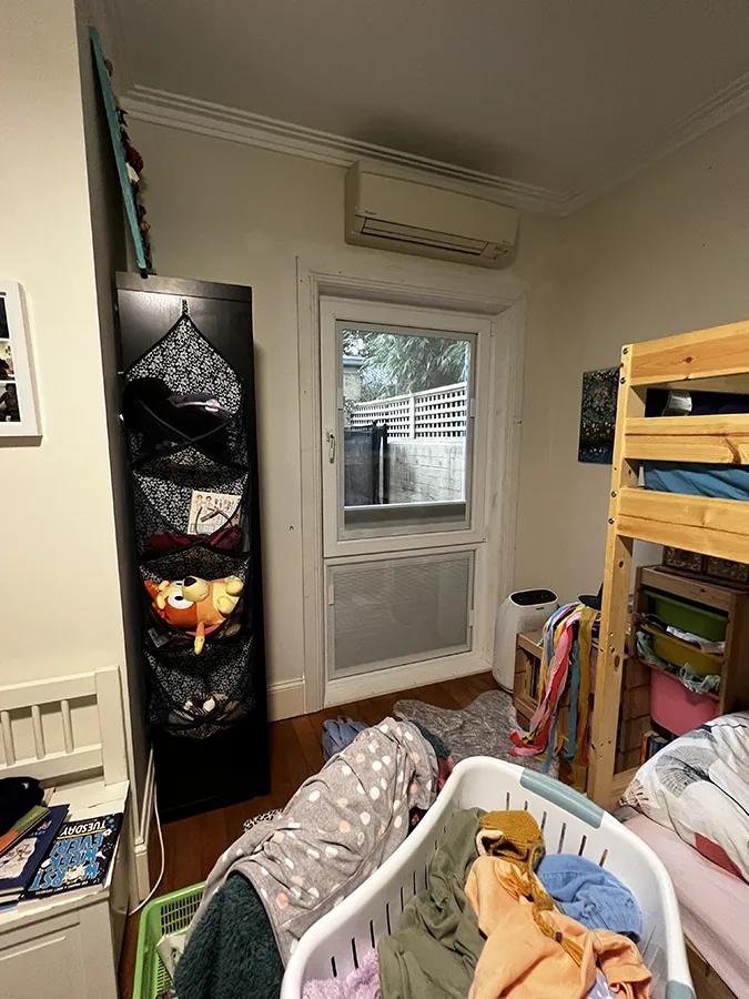
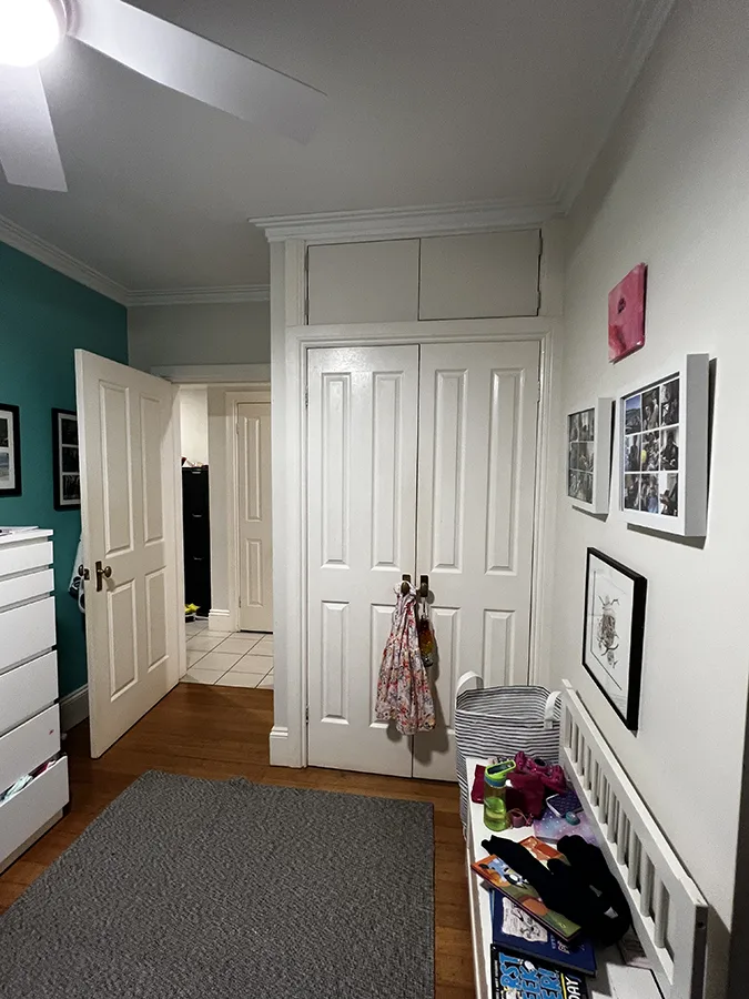
BEFORE
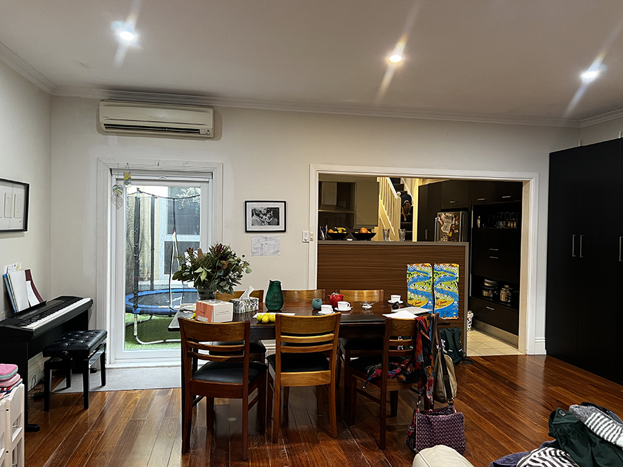
BEFORE
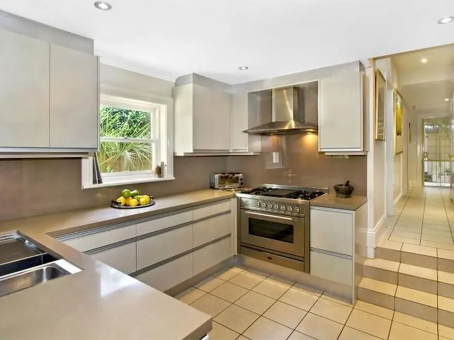
BEFORE
BEFORE
BEFORE
BEFORE
BEFORE
BEFORE
Design Outcome
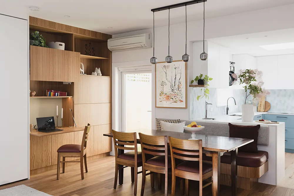
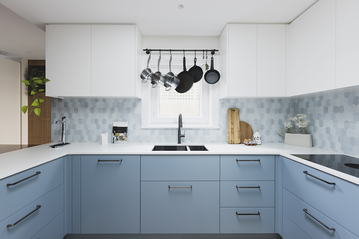
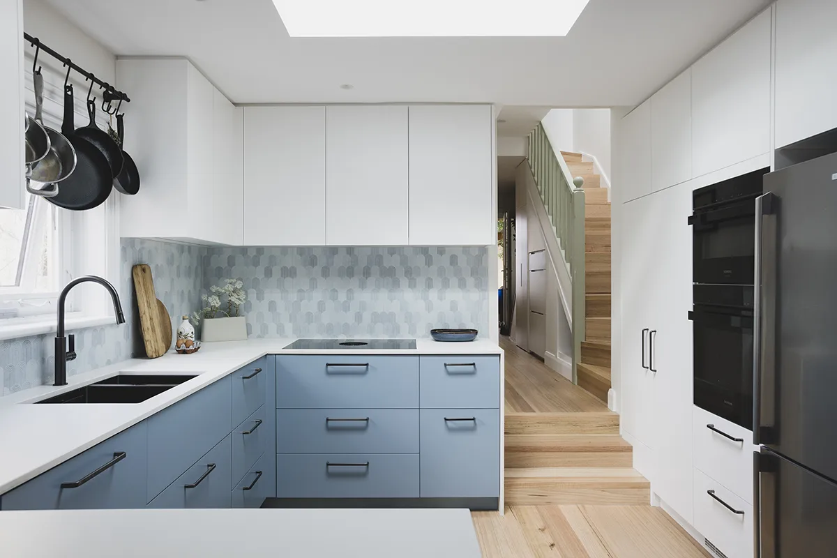
Kitchen
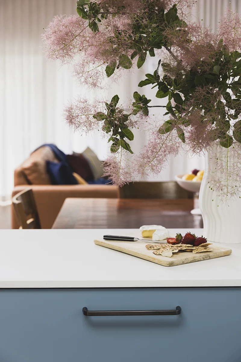
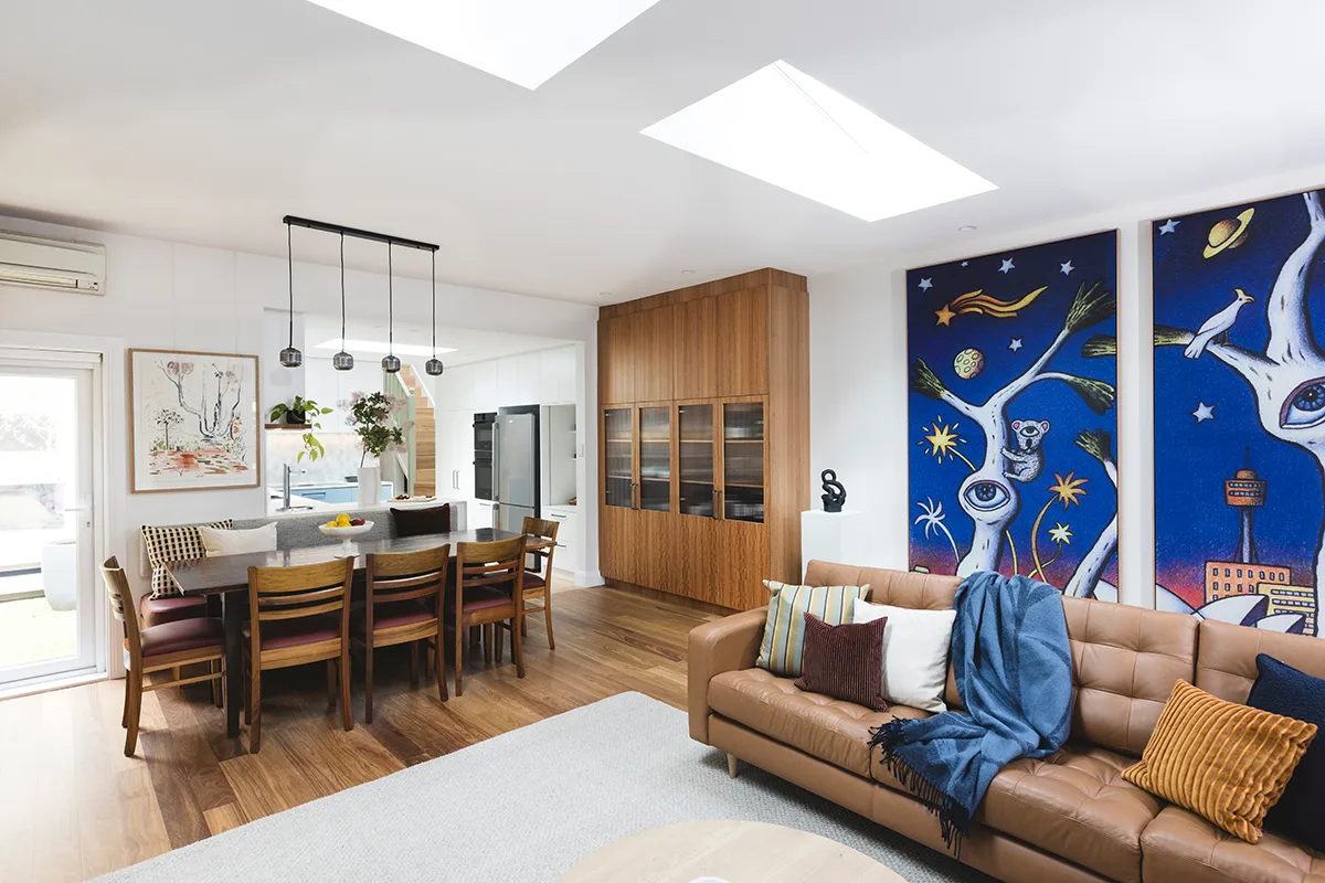
We retained most of the kitchen layout, but widened the opening to the living room to improve flow and connection between spaces. A Bora cooktop with integrated downdraft extraction allowed us to maximise overhead cabinetry. Deep drawers and a redesigned pantry improve everyday usability.
A new skylight brought much-needed natural light into the kitchen. It helps the kitchen feel taller and brighter. The client asked for crisp white cabinetry and we paired it with soft blue joinery, colour-matched to the splashback tiles. Metal fixtures are gunmetal - warmer than just black - and the durable white Laminam benchtop is highly practical.
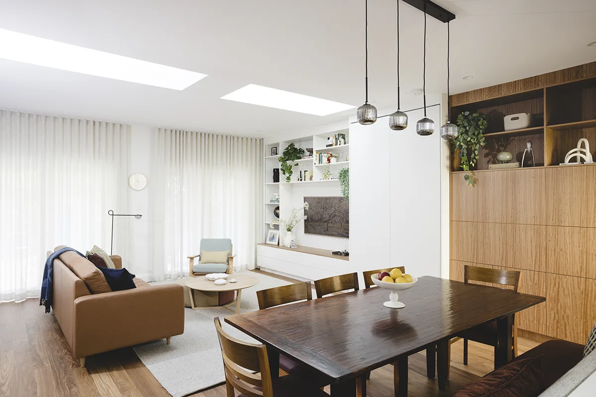
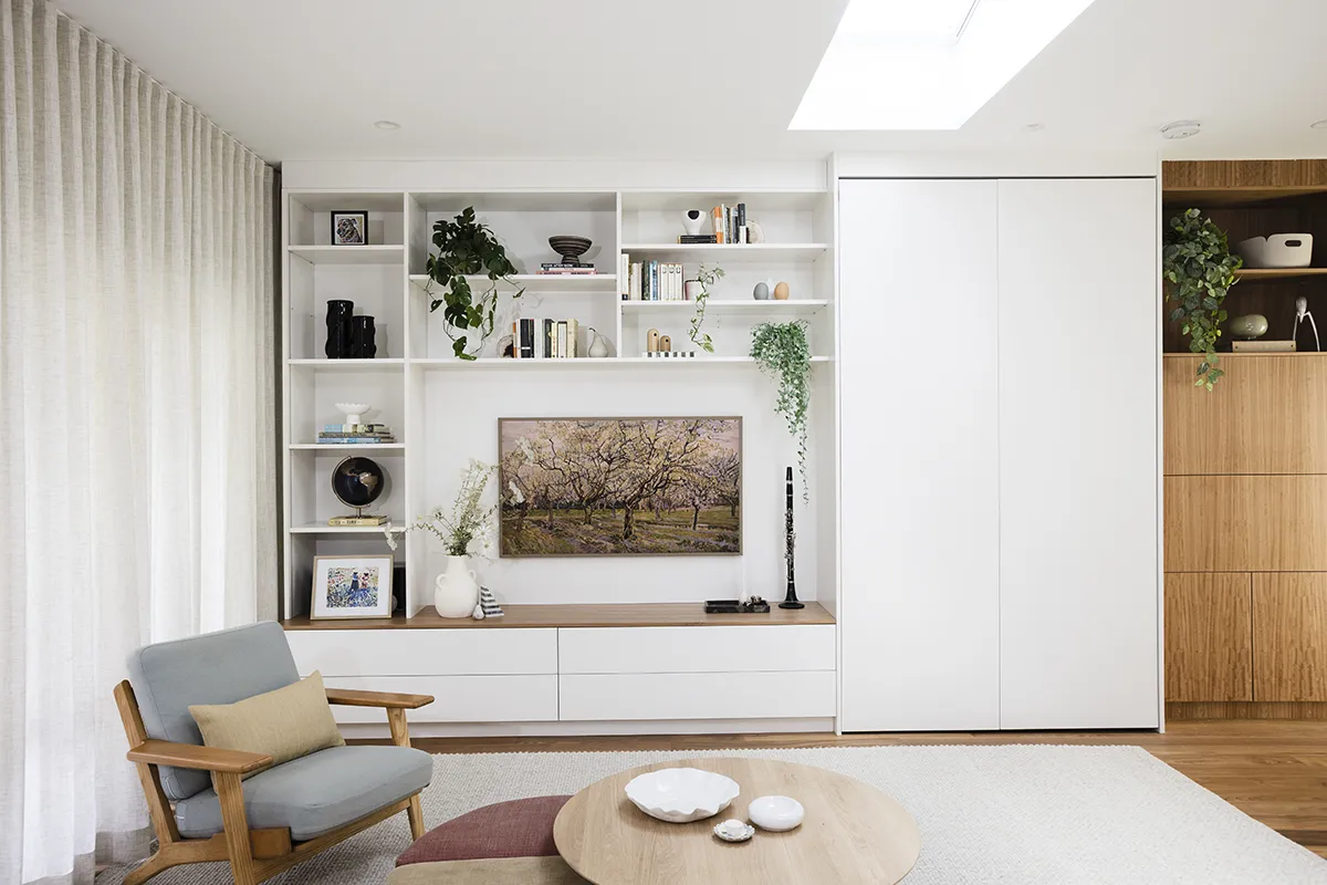
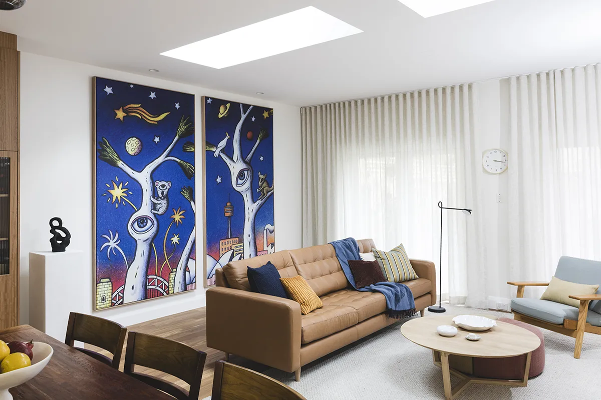
Living Room
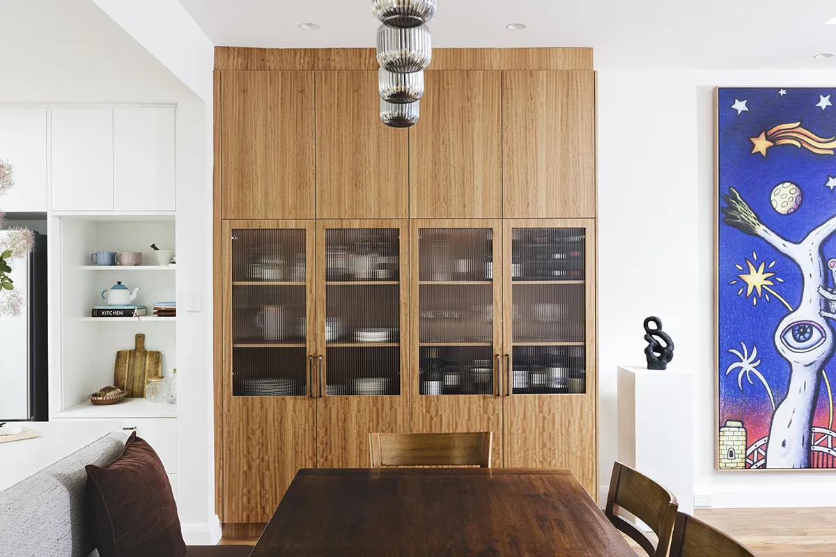
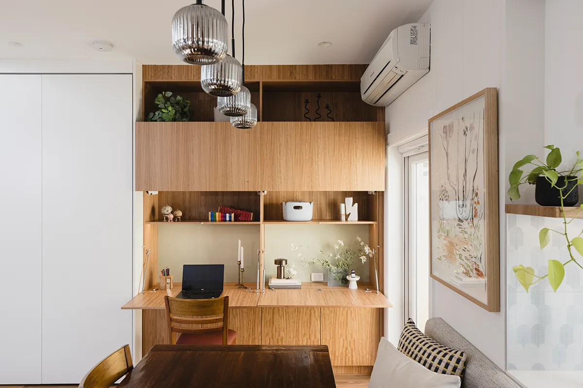
Large skylights completely transformed the once-dark living area to light-filled and airy room. We designed a full wall of custom joinery to divide the room into family living zones.
The dining area includes banquette seating, with hidden access to the Zip tap control unit behind a removable back rest. We used the existing dining table, with its layers of memories (read:marks), but modified the legs to suit the banquette. On one side of the dining area there is cabinetry for crockery and glassware. Opposite, we built concealed study nooks for the children, with fold-down desks. They are easy to access but look calm and pretty when not in use.
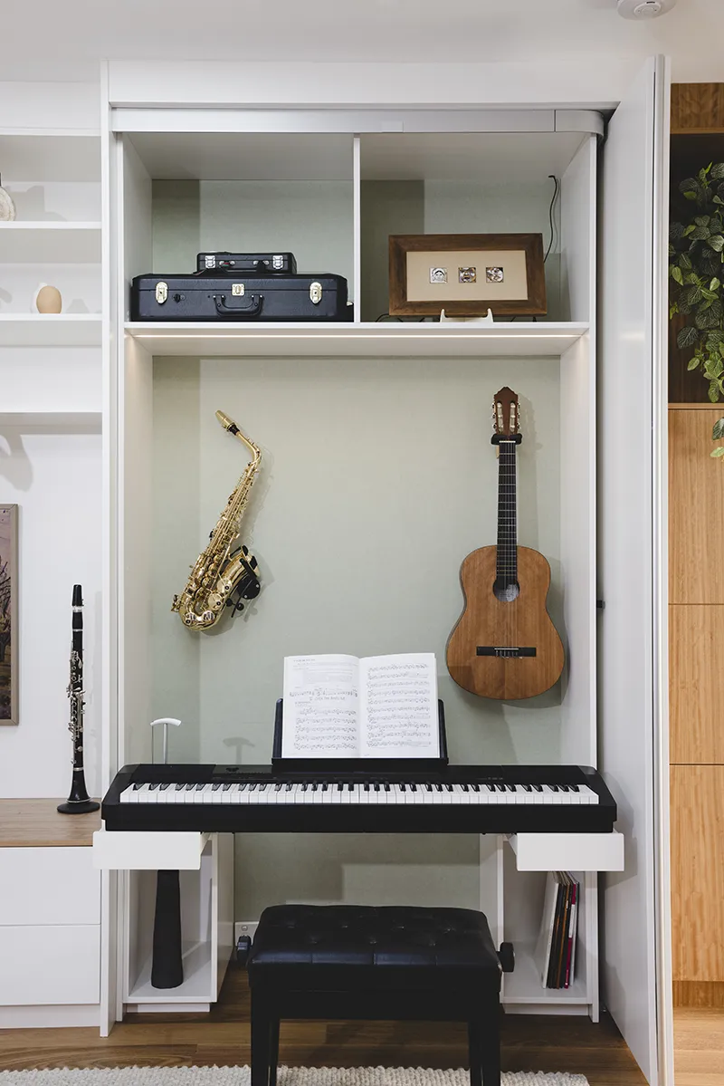
A bespoke music cabinet became the centrepiece of the room. It was designed to store and display multiple instruments and also function as a practice space. Pocket sliding doors allow the area to be completely concealed when closed, and the keyboards pull out on a lockable shelf when it's time to practise. We added acoustic felt to the back of the music cabinet and desks for extra comfort.
The rest of the cabinets are simple on purpose, just open shelving and media storage, with integrated lighting.
For the decor, we were inspired by the family’s Sydney 2000 flags that we had framed and hung on the wall. We picked burgundy, blue, tan and green accents from them.
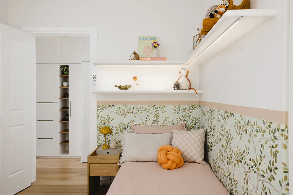
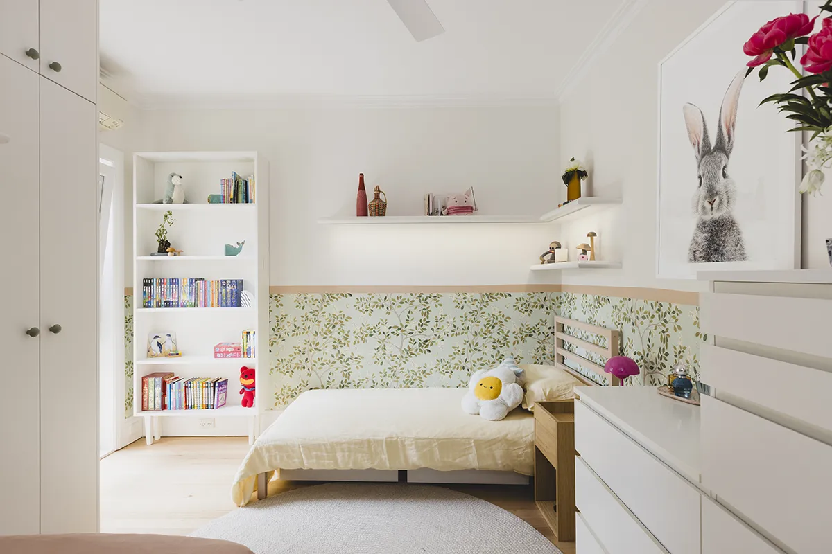
Kids' room
Despite the room’s awkward shape, we managed to create space for two single beds, a compact wardrobe and additional storage. Each child now has their own display shelving, bedside table and personal space. The super cute floral wallpaper and cheerfully painted beds bring colour and character to the room.
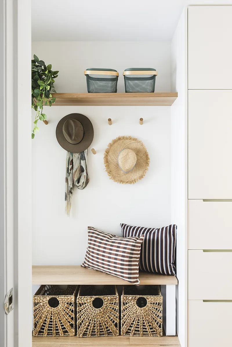
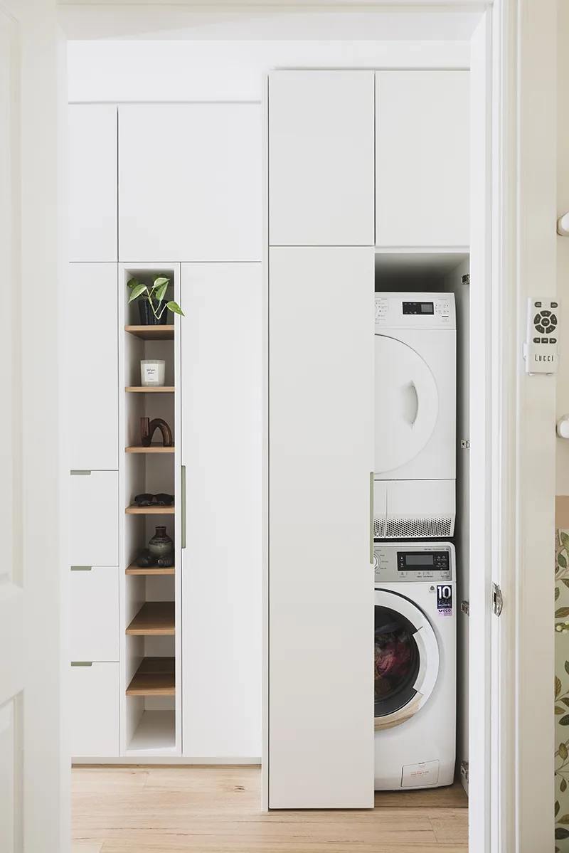
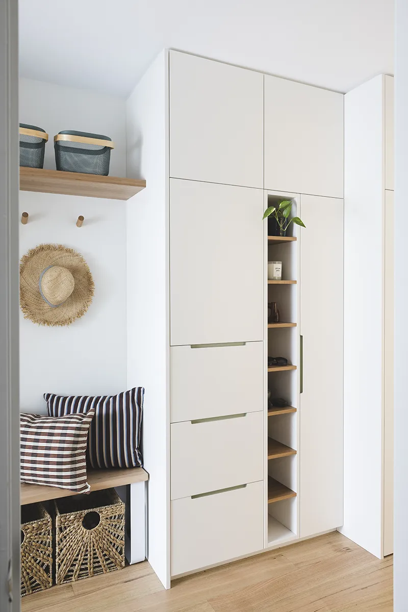
Hallway and Laundry
The hallway was reworked to become both practical and welcoming. We reduced the size of the laundry to the bare minimum and removed a protruding wall. This created enough space for shoe storage and broom cabinet, hat shelf above a bench seat and a skateboard cabinet.
We changed the uninspiring tiles to timber flooring and improved the lighting. Little cheerful green accents and balustrade now give the entrance warmth and personality.
The Home Now
We are all very happy with the result. The finished home feels calm, functional and personal to the family. Rather than demolishing or moving, the clients now see it as their forever home — a proof that thoughtful design and clever storage can completely transform the way a house feels and functions.
The living room of this home has been nominated a Finalist in the 2026 KBDI Design Awards, in Design Spaces category. Regardless of whether it wins or not, I feel like I've won already, because of what the clients said: "We already felt very lucky to be living in your design, and this is some lovely extra recognition". How sweet is that!
Looking for smarter storage solutions and better flow in your home?
Sari
Photos by Sam McAdam-Cooper.
Styling by Melanie Andriolo.