logo90pxHlogo90pxHlogo90pxHlogo90pxH

  • HOME
  • DESIGN SERVICES
    • INTERIOR DESIGN AND DECORATION
    • BATHROOM DESIGN
    • KITCHEN DESIGN
    • CUSTOM JOINERY AND FURNITURE DESIGN
    • PROJECT CONSULTING
    • FURNITURE SOURCING AND PERSONAL SHOPPING
  • TESTIMONIALS & PHOTOS
    • TESTIMONIALS & PHOTOS
    • PROJECT GALLERIES
  • DESIGN BLOG
  • CONTACT
âś•

Contact Us

Interior Design Quiz

START

15 min Introductory Call

BOOK

Initial Design Consultation

BOOK

One-off Design Consultation

BOOK

Get in touch with us

    Please add me to your newsletter list

    Follow us on Instagram

    Marcus' favourite colour: Blue 🌊 Blue is a clas Marcus' favourite colour: Blue

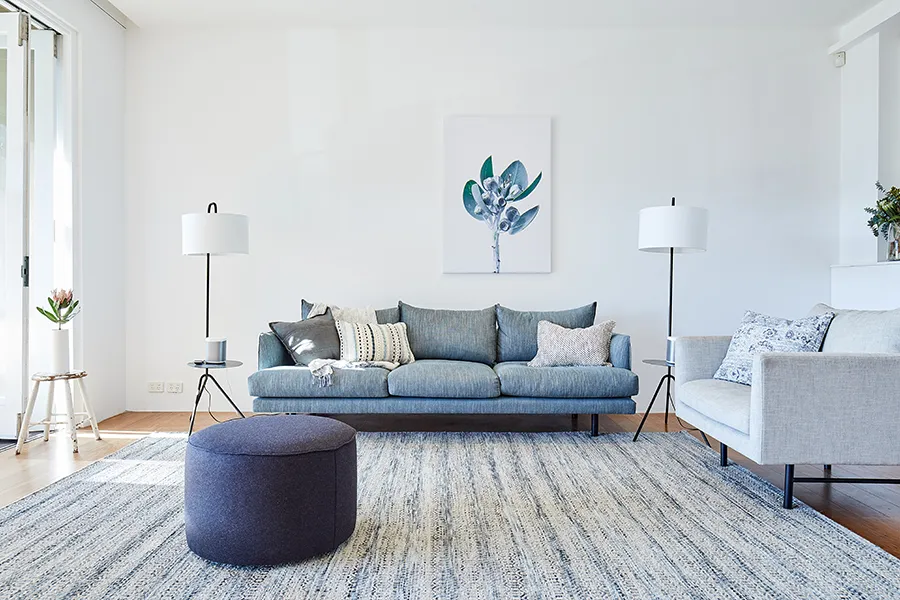
🌊 Blue is a classic in art and design, with favourites from Picasso, David Hockney, and Yves Klein. Blue works beautifully with metallics, timber, marble, and many other materials. Whether you choose dark inky blues to add a deeper mood, or brighter blues to uplift the mood, we think blue brings great energy to a space.

The most classic combination is blue with white - it looks crisp and chic. Since blue is the colour of the sky and the sea, it has a naturally calming effect. Blues work best in a sunlit room rather than a dark space, as you don’t want it to feel too chilly.

We love using blues across all types of rooms and spaces. Incidentally, it is the favourite colour of the majority of our clients too.

Here’s some blue inspiration for you:

@‌mecquestore (Tom Dixon Water Candle)

@‌ivylaneagency (Foundry Blue Luno vase)

@‌elenorra_au (Lainey Desk Lamp)

@‌designbythem (Bobby Stool by Daniel Tucker)

Design: @‌insidesignsydney

Photography: @‌sammcadam_cooper @inwardoutward

Styling @‌melandriolo

#BlueInDesign #InteriorInspo #ColorTrends #interiordesignersydney #balmaininteriordesigner
    Sari’s favourite colour: orange Also: the least Sari’s favourite colour: orange

Also: the least liked colour amongst our clients, sadly.

Have you noticed that Sari often wears something orange, but never at the first meeting with a new client!

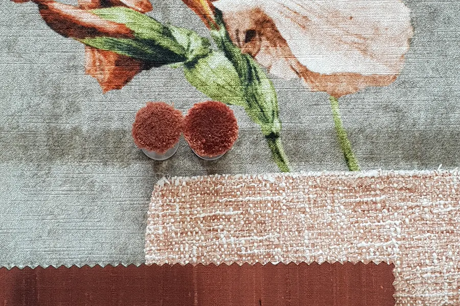
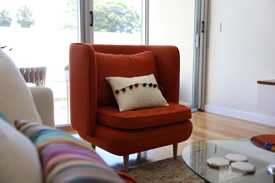
Orange is the colour for energy and enthusiasm. It can be toned down to be earthy and warm.  It combines particularly well with blue, and we are often asked for a colour scheme with orange and blue. Burnt orange is excellent as a styling colour in small doses, as it adds interest without overpowering.

Design: @‌insidesignsydney

Photography: @inwardoutward

Styling @‌melandriolo

#orangeindesign #colourstory #orangeininteriors #interiordesignersydney #balmaininteriordesigner
    Our client in Sydney’s Rozelle wanted a streamline Our client in Sydney’s Rozelle wanted a streamlined kitchen where all the mess of life could be hidden in a flash. In our design, we came up with the idea of what if the backsplash became hidden cupboards.

We created extra storage that could be used to house a coffee station, electricals, and even a breakfast nook, with sliding splashback panels in front.

The neutral palette of warm white, oak, and marble patterned porcelain made it a calming space but also highly functional.

Look out for other clever ideas we rolled into the design of this kitchen in future posts!

Design: @insidesignsydney
Photo: @sammcadam_cooper
Styling: @studio_marcus_hay_

#cleverdesign #storagesolutions #kitchendesign  #interiordesignersydney #balmaininteriordesigner
    Florals can be bold and graphic; they can also be Florals can be bold and graphic; they can also be sweet. At INSIDESIGN, we are fond of them all. Often in a room with solid colours, Florals can add a touch of instant prettiness as a statement or just a touch in the way of a cushion or even flowers in a vase. As humans, we are all drawn to nature, so it makes sense to have some of this element in your home.

We loved this custom-made bean bag that is the pride and joy of one of our clients' dachshund, with a matching cushion for the owner’s bed. We often use botanical-themed art, and Sari is well known for wearing floral prints herself, particularly in spring/ summer.

Spring/ Summer can be anytime of the year at home with a sprinkle of nature's prettiest invention.

Design: @‌insidesignsydney

#floralindesign #floralprints #springsummer #interiordesignersydney #balmaininteriordesigner
    Let’s talk about flowers. In Australia, we are Let’s talk about flowers. 

In Australia, we are lucky to have such a great range of floral varieties available to us. Much of our natural foliage is graphic and striking, allowing for a simple and modern approach when styling them.

Often, sticking to one variety in a vase is enough to make a bold statement. There are also many excellent silk and faux varieties on the market; you can’t tell the difference!

Choosing the shape of your vase is just as important as the tools you use; investing in a good pair of snips is definitely worth it.

When creating compositions, try to stray from the expected by incorporating different heights in the way you cut your stems. Remember, flowers all on one level can look plonked in a vase!

Our favourite vase of the moment is:

Celeste Teardrop Marble Vase by Foundary from @‌ivylaneagency

Plant Care complete pruning set from @‌finnishdesignshop


Design: @‌insidesignsydney

Photography: @‌sammcadam_cooper @inwardoutward

Styling @‌melandriolo

#FloralDesign #AustralianFlowers #InteriorStyling #interiordesignersydney #balmaininteriordesigner
    ✨ One more sleep to go!! ✨ The KBDI Design Awards ✨ One more sleep to go!! ✨

The KBDI Design Awards Gala night is tomorrow and I have all fingers and toes crossed!!

I would very much like to win the *Small Bathrooms NSW* category two years in a row!!

Wish me luck! 

🍀 🤞✨🍀

Design by @insidesignsydney 
Styling by @melandriolo 
Photos by @sammcadam_cooper 

Joinery by @divinekitchens 
Lights by @lightco_australia 
Tiles by @livingtiles and @rjmcalistertiling 
Tapware @faucetstrommen via @justbathroomware 
Bath @hammockbathco 
Basins @omvivo
    We had a wonderful time yesterday at "The Design T We had a wonderful time yesterday at "The Design Tribe" in Doody Street, Alexandria in Sydney. A collective of great Australian businesses, including @molmic_sydney_showroom, @molmic_sofas @skupafurniture @workspacecf_ @inthesaclinen @rafflestextiles @lightco_australia @slh_furniture 

Great Coffee and the cutest snacks, We also loved the presentation by @relove_au 
 An amazing organization, ReLove is dedicated to providing people in crisis with essential home furnishings, offering a supportive and empowering space where individuals can select the items they need to create a fresh start. By helping people rebuild their homes and lives, we aim to restore dignity, comfort, and a sense of choice for those facing challenging times. 

Thanks so much for the invite, It was so nice to see so many familiar faces and to take in some warm rays of sun in the courtyard. 

#interiordesign #relove #molmic #designtribe #sydney
    🎨 Colour doesn't always need to come from the wall 🎨 Colour doesn't always need to come from the walls.

A cheerful patterned rug, a couple of colourful cushions, or even changing the knobs on a dresser can be enough to give a room a different feel. The best part is that if your tastes change, you can swap them out without starting all over again.

Kids' rooms are a great place to be a little bolder with colour. It's a simple way to add personality and create a space that's fun to spend time in.

Sometimes it's the smaller choices that you’ll end up enjoying the most.

Design: @‌insidesignsydney

Photography: @‌sammcadam_cooper @inwardoutward

Styling @‌melandriolo

#InteriorDesign #ColorInspiration #HomeStyling #interiordesignersydney #balmaininteriordesigner
    Wallpaper is not for the unsure! Unlike paint, onc Wallpaper is not for the unsure! Unlike paint, once you've put wallpaper up, it is a commitment. With paint, you can immediately repaint it, but with paper, unless you get peel & stick (which can still be hard to get off), it’s trickier to remove.

Finding a pattern that really resonates with you is the challenge, and as we see new designs all the time, you can lean on us for advice.

Nothing makes a bigger impact than a great pattern. It will often be the first thing people notice when they walk into a room; however, you can use it in these ways to minimise the overload:

Use it below the chair rail height and leave the top of the room a solid colour; we did this recently in a kid’s bedroom seen here.

Use it just as a feature wall. Some like to cover all walls, but a feature wall will allow you to create contrast with clean walls in the space.

Use more of a textural wallpaper, like grasscloth, that gives you the texture without the big pattern. (Do remember, though, that you will always see the joints with grasscloth!)

Be playful, use it in a nook or behind built-in shelves

We do love using wallpaper, and at the end of the day, life's short, so have some fun with your walls!

#wallpaper #patterininteriors #textualwallpaper #insidesignsydney #interiordecor
    What a busy busy day today was, shooting our Rozel What a busy busy day today was, shooting our Rozelle project with @sammcadam_cooper . Here’s some mobile shots, proper photos to follow. 

Hero of the day was @studio_marcus_hay_ with amazing styling! 🤩🌸

Thank you to @mecquestore and @marc_et_ for beautiful accessories! ❤️

I’m particularly proud of the cabinet behind the splashback. It required a lot of thought, but it keeps the kitchen tidy and neat, plus there’s nearly 900mm deep drawers under!

Also, I love the bathroom tiles from @livingtiles - we used them horizontally and vertically. Which one is your favourite?

PS. The house is for sale - in case you’re on the market for a house with a fantastic kitchen and bathrooms. 

#balmaininteriordesigner #photoshootday #kitchendesign #bathroomdesign
    Rugs with patterns - do you love them or hate them Rugs with patterns - do you love them or hate them?

A patterned rug instantly anchors a room and creates a defined space. It also adds colour and visual impact to the eye. To keep the space balanced, pull accent colours from the rug's pattern to use in your cushions, artwork, and decor, even flowers!

For a fun take on it, combine patterns of different scales, such as pairing a large floral print with a smaller stripe or geometric design. Pattern on pattern is not as scary as it sounds!

We have used many bold designs and patterns in rugs for our clients, and they have loved the effect.

What do you think?

#patternedrugs #boldcolour #accentcolours #interiordecor #interiordesignersydney
    The pouf can be the final touch, giving a space th The pouf can be the final touch, giving a space the needed punctuation to finish off the room. These versatile decorating additions add personality and can be used in various ways in your home.

You could use a pouf as a coffee table with a decorative tray on top. Contrast hard lines of a squarish sofa with a round surprise. Pair different materials, like jute or leather, for a warmer, more personality-driven version. In the bedroom, a pouf at the foot of your bed serves as a place to throw your clothes (We all do it!)

Be considerate of the height when choosing a pouf, as they do vary. Look for a height that matches the height of your sofa if you want to use it as a footstool; choose a firmer-filled one for pairing with a dining table if using for seating.

The colour you choose can be the personal touch; contrasting colours often work better so as not to be too matchy-matchy.

Design: @‌insidesignsydney

Photography: @‌sammcadam_cooper @inwardoutward

Styling @‌melandriolo

@mecquestore (Forene Cylinder Pouf in Choc)
@interiorsecrets (Everet Round Ottoman)
@by_designstuff (Ferm Living Podo Stool, Khaki)
@racheldonath (Bombo Ottoman, Cinnamon)
@rj.living (Roll Ottoman in Opal Ochre)
#HomeDecor #PoufStyle #InteriorDesign

#interiordesignersydney #balmaininteriordesigner #decoratingwithpoufs #ottomans #design

    @insidesignSydney INSTAGRAM

    INSIDESIGN, Sari Munro
    PO BOX 518
    Balmain NSW 2041, Australia
     

    KBDI small bathrooms NSW winner 2025 sari munro insidesign


    © 2026 INSIDESIGN. Interior design, Balmain, Sydney. | Site by 8WEB