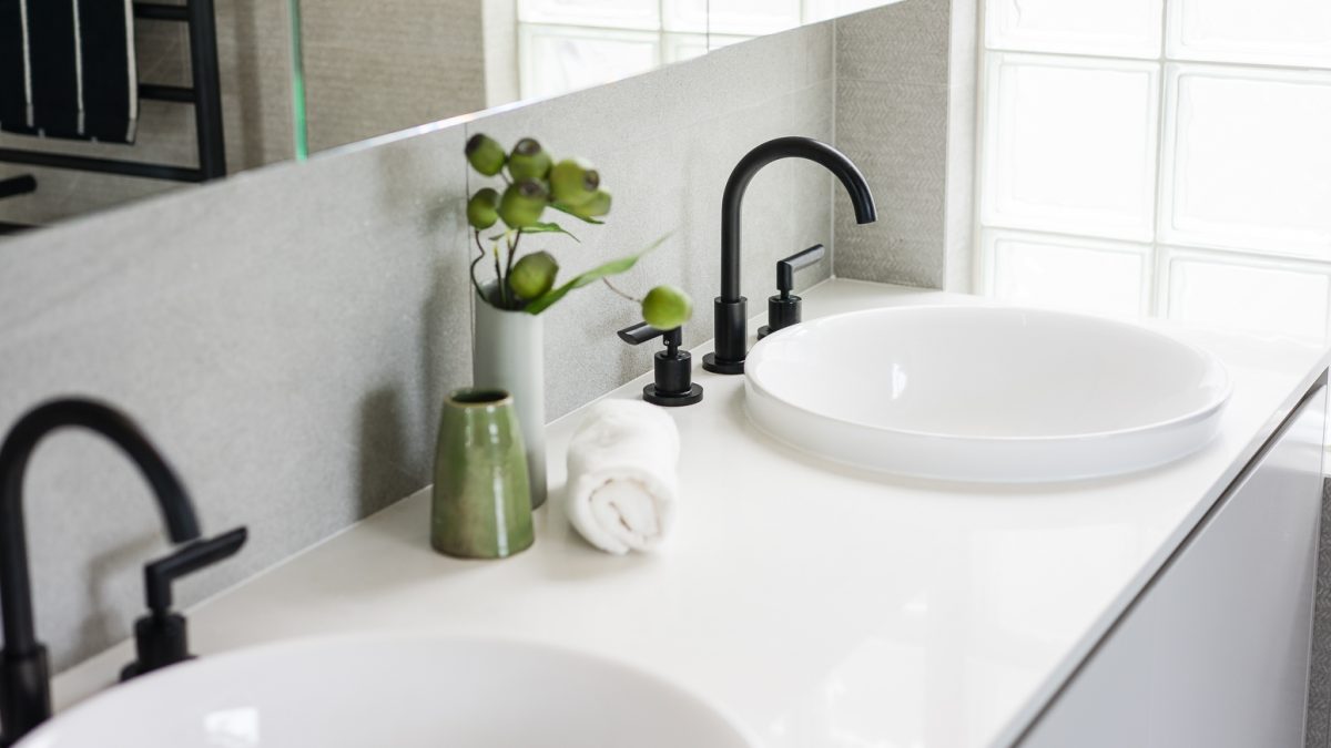
And the Award goes to…
Champagnes out for tomorrow!
I’m practising my Oscar’s (read: KBDi Designer Awards 2020) speech. Or, in case I don’t win the Small Bathrooms Designer Award of the Year or the Laundry Designer Award of the Year or even the First Time Entrant Award, for all which I’m nominated as a finalist, at least I’m extremely happy and proud to have been nominated!
*) KBDi = “The Kitchen and Bathroom Designers Institute (KBDi) is Australia’s premier specialist kitchen and bathroom designers’ association. It is a national organisation with chapters located around Australia, and a strong commitment to the continual improvement and professional development of this increasingly specialised design field.”
Here’s a description of my designer award finalist bathroom and laundry design work.
1. Bathroom design
The Brief
Project overview
- Renovating a dated and impractical main bathroom in an Inner City cottage.
- Client: a young professional family of four.
The site description
- L-shaped bathroom with a large corner spa.
- A window or door on each wall.
- Complicated hip and valley roof structure with mainly low wall heights.
Objectives
- More practical layout.
- Bath in front of the window, with a separate shower.
- Increased storage including a linen cabinet if possible.
- Double vanity with inset basins.
Look and feel
- Understated modern high-end.
- Interesting tiles, not glossy or pure white and no subways or hexagons.
- Rounded shapes.
The Before photos
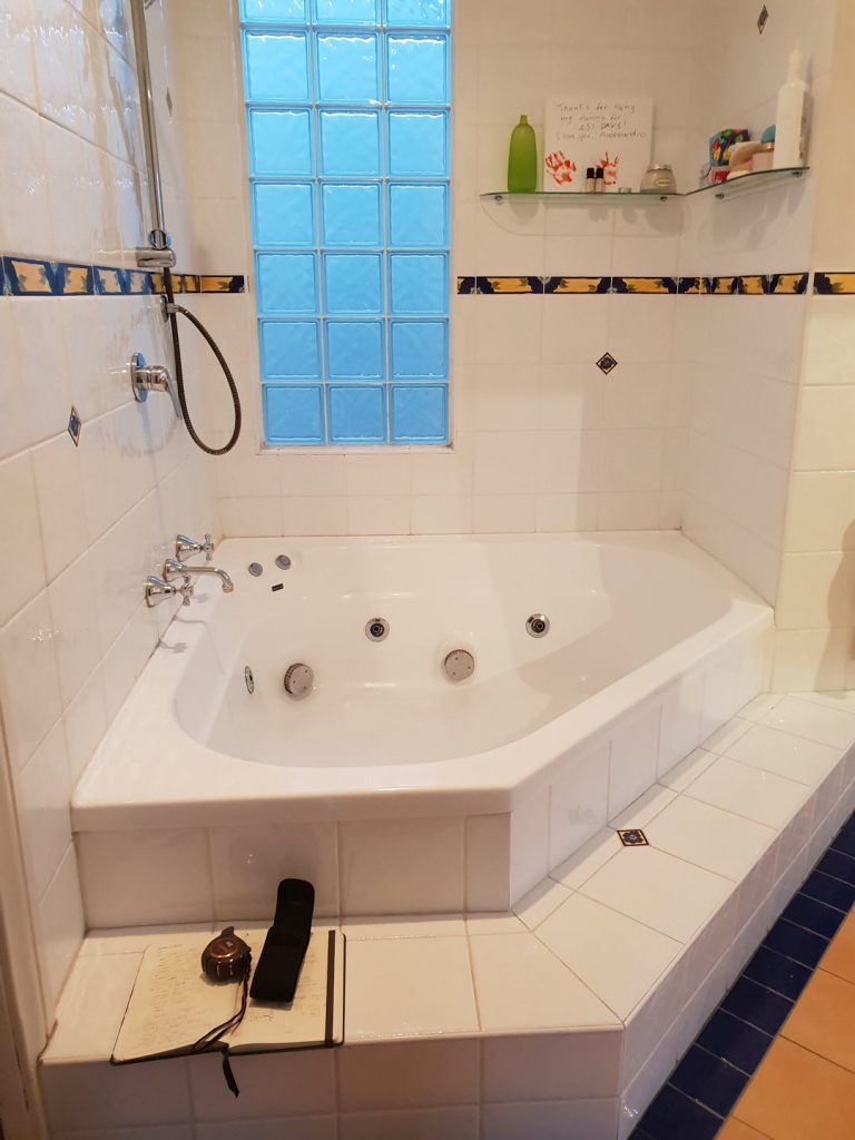
Before with the big spa bath
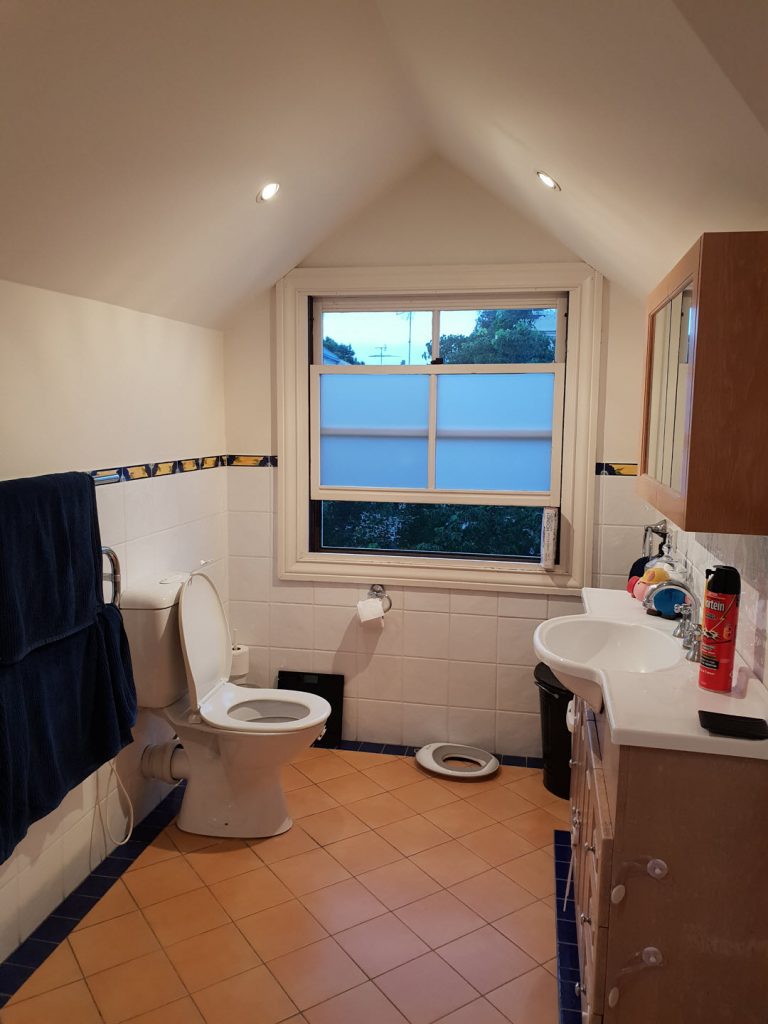
Before with small storage
The design process
The starting point was the client‘s dream of having a bathtub by the window. The current spa bath with a shower wasn’t practical and the mirror cabinet was too low for the client to see himself.
The layout had to be completely reconfigured. Initially we looked at multiple ways of doing it, but the low wall heights and various corners, doors and windows in the room restricted the vanity and shower placements. Of the two options I presented, the client chose the more practical one: vanity on the only high wall and an adjustable shower on the lower wall. As a result, the bath and shower create a separate wet room.
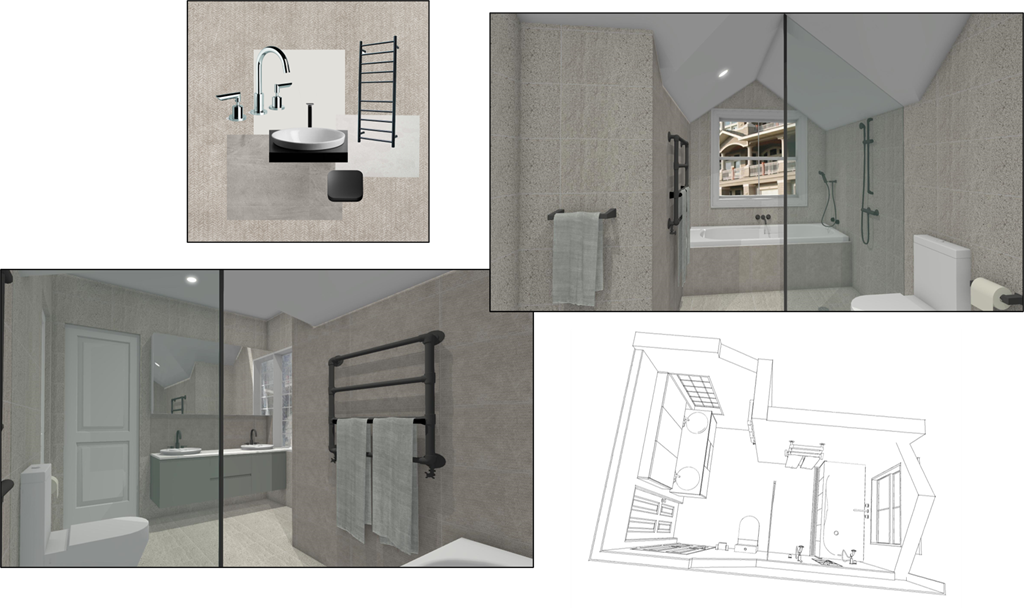
The award finalist bathroom design: INSIDESIGN
The design had no room for a linen cabinet, but during demolition phase we discovered unused space in the eaves and utilised it for extra storage. This allowed the wall opposite the vanity also to be pushed further into the eaves making the room wider.
That was a happy find.
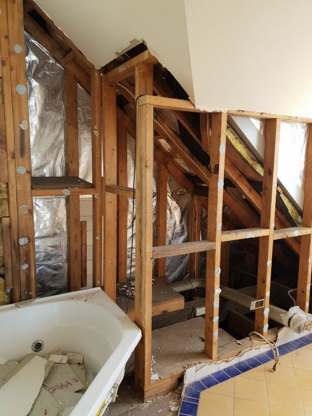
Space in the eaves
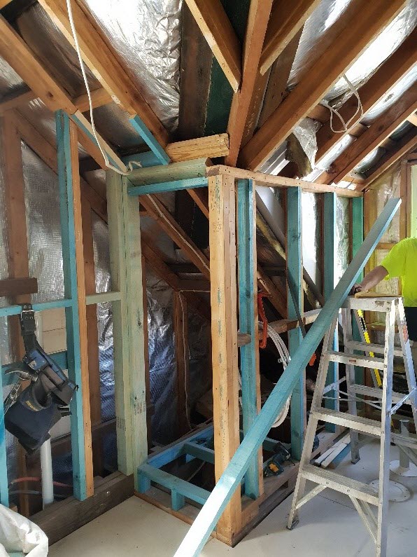
Extensive wall framing
We did some unhappy finds too, as often happens when renovating bathrooms. Based on the last six bathroom jobs it seems that proper waterproofing was unheard of in the 1980’s and 1990’s.
In this case, also the roof had shifted and all walls needed straightening and supporting. Luckily there was a good builder involved. The renovation was done by Ballast Point and they were fantastic throughout. There wasn’t a problem they couldn’t solve. And the tilers they hired for this job were out of this world with their preciseness and attention to detail.
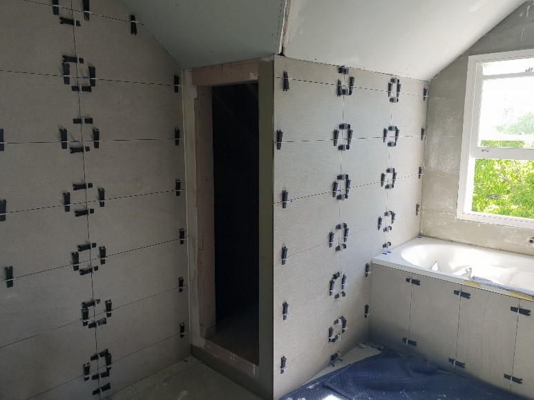
These tiles are straight!
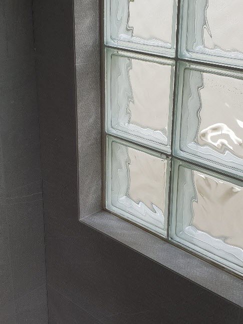
Look at the tiling finish!
The result
Now the overall feel of the room is dreamy and moody, punctuated by black tapware. The matt porcelain tiles have a subtle, soft pattern and the cabinetry was painted with a matching light taupe colour.
The hero of the room is the floor-to-ceiling shower screen with a black frame – it is practical but also creates a striking effect of exact lines and symmetry, further highlighted by the impeccable tiling.
This is what it looks like now. Do you think it was worthy of the finalist nomination for the Designer Awards?
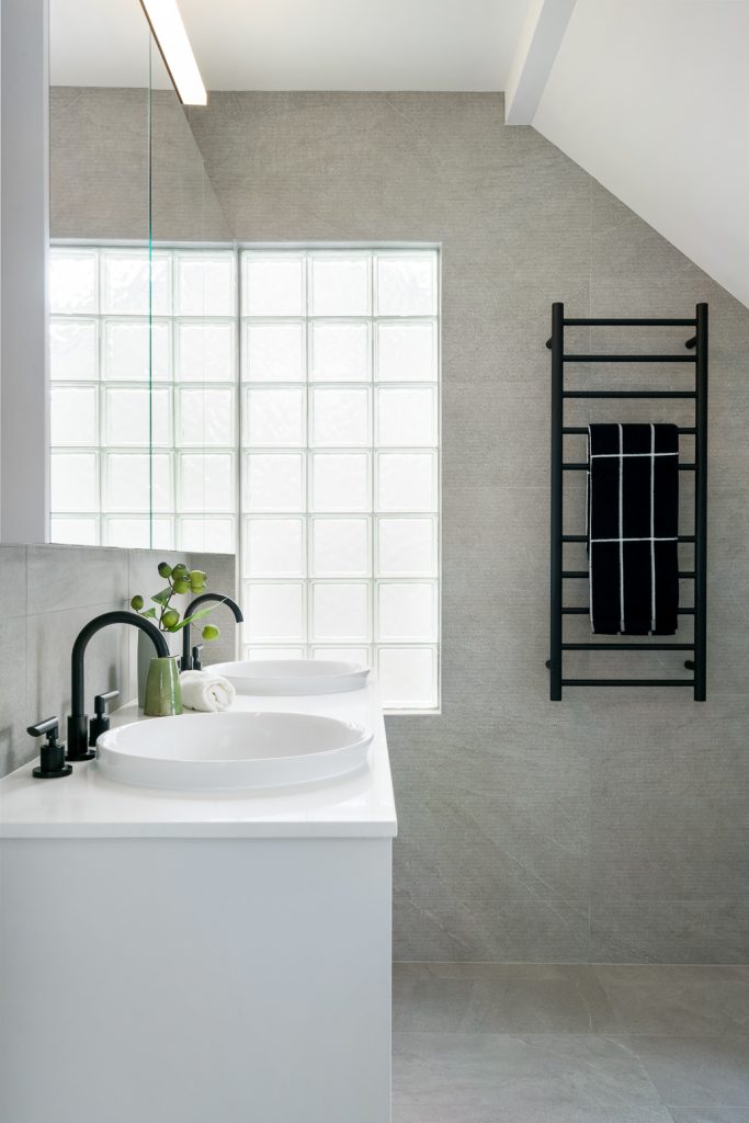
Design: INSIDESIGN – Photo: Rebecca Lu
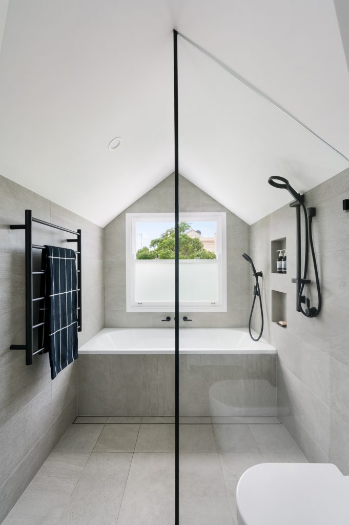
Design: INSIDESIGN – Photo: Rebecca Lu
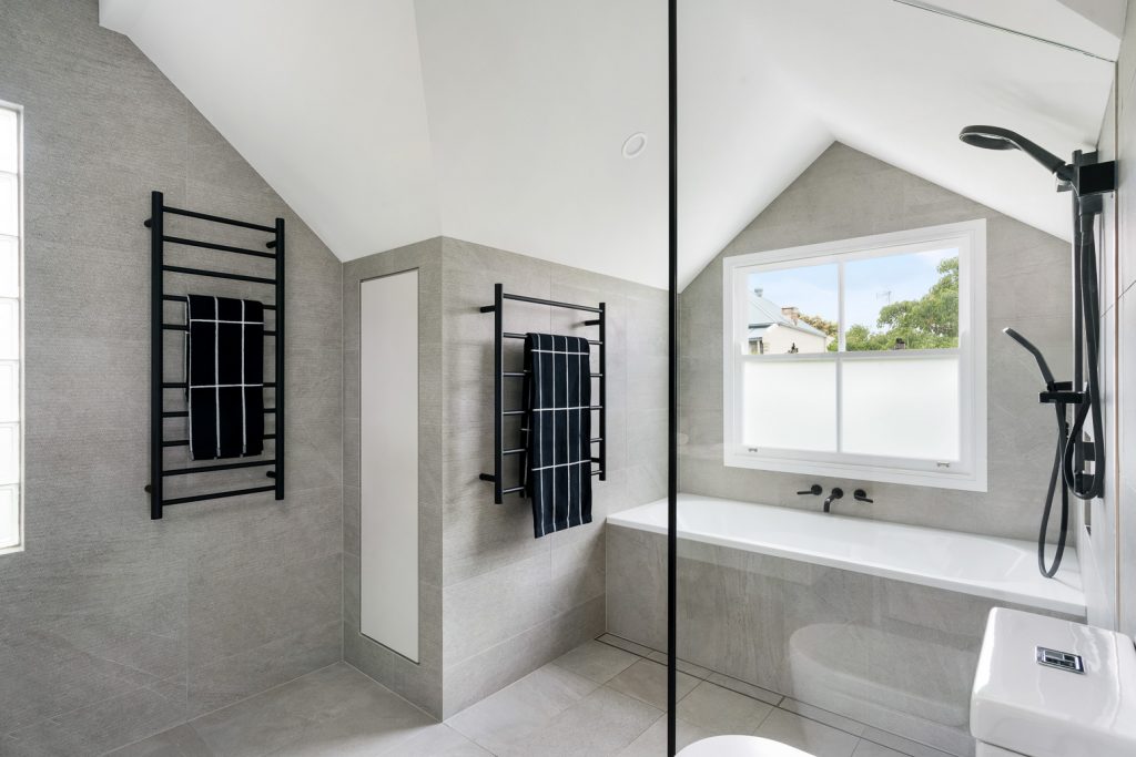
Design: INSIDESIGN – Photo: Rebecca Lu
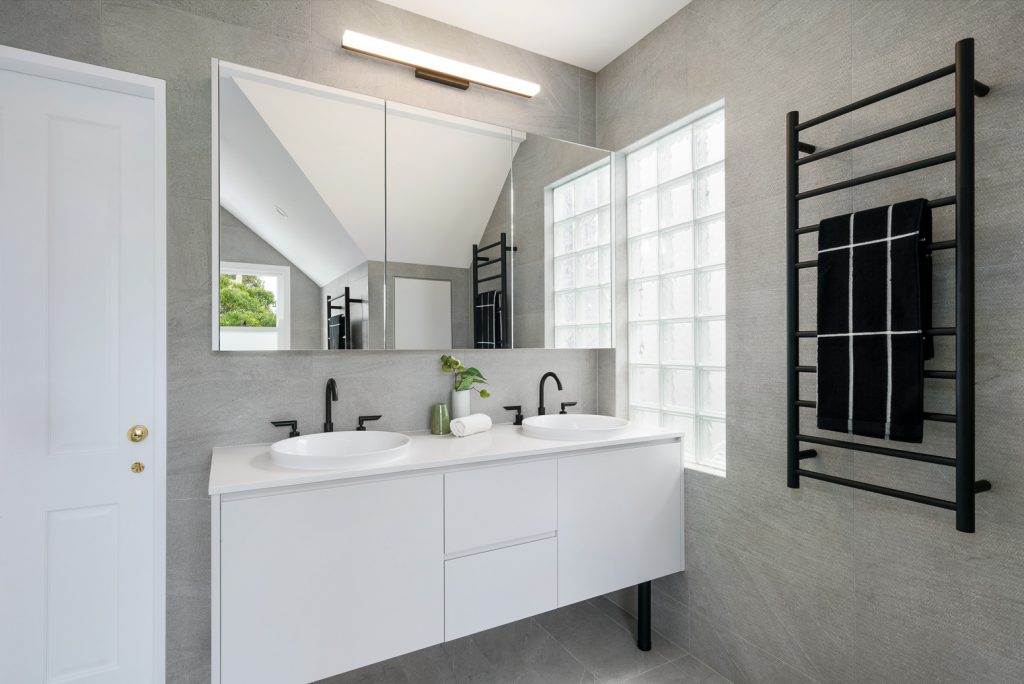
Design: INSIDESIGN – Photo: Rebecca Lu
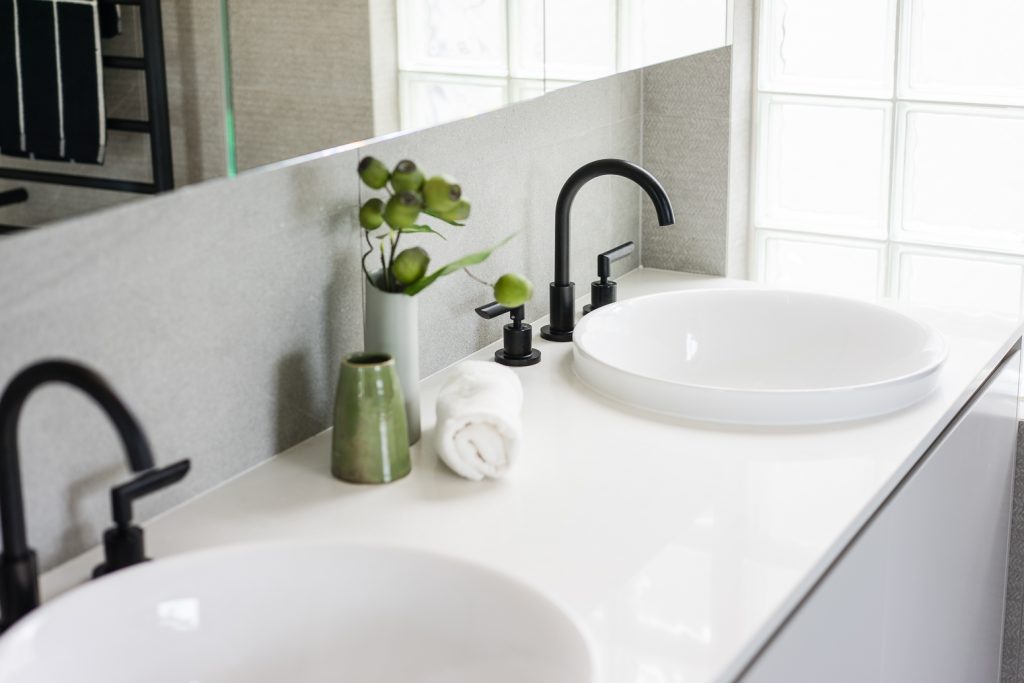
Design: INSIDESIGN – Photo: Rebecca Lu
2. Laundry design
The Brief
- Renovate a laundry room, which doubles as a guest bathroom, powder room and cat toilet.
- The current laundry had no bench space or storage, apart from a tall cabinet recessed to the wall.
- The room was dominated by a chest freezer – which the client wanted to incorporate to the new design as they use it a lot.
- Two doors in opposite corners of the room.
- Shower was excessive given it was only used by guests.
- Include plenty of storage, a large cat litter box and a freezer.
- Look good with bold or bright coloured cabinetry.
- Utilise existing plumbing locations for sink, hand basin, shower and toilet.
- Only be tiled around the shower area to keep costs down.
The site:
The new laundry / bathroom should:
The Before photos
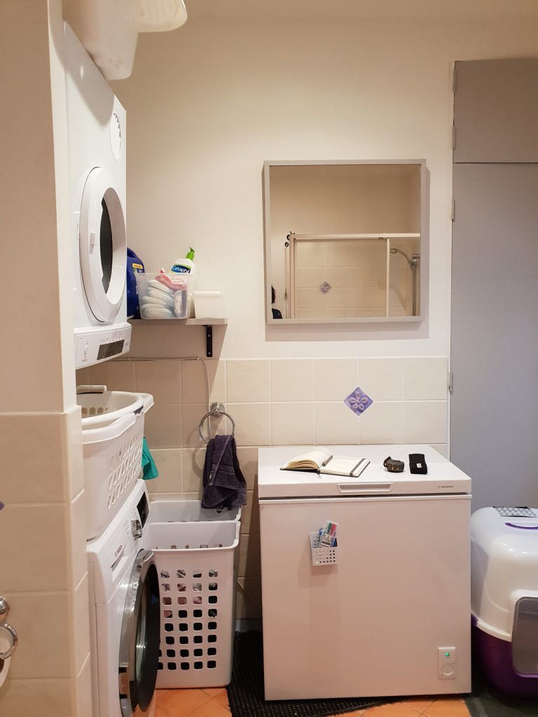
Laundry before renovation
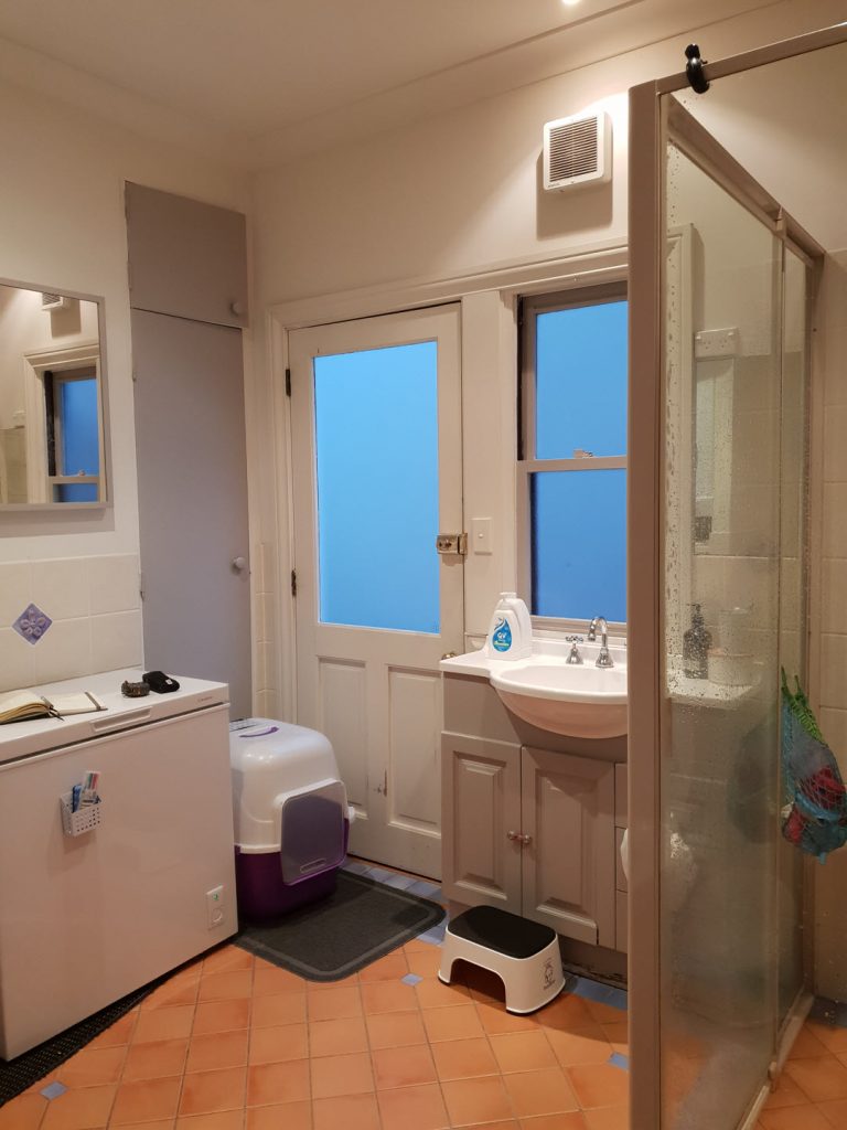
Laundry before renovation
The layout dilemma
The cabinetry layout including the freezer and bulky cat litter required various iterations, because most layout options would block the exit to the side door or add no significant storage. The side door was particularly a pinch point: it was very challenging to fit the washing machine, sink and freezer in the space left of the recessed cabinet, with a hand basin under the window, while keeping the exit to the side door clear. Eventually the chest freezer was swapped to a bar freezer and the door hinges reversed, and that solved the problem.
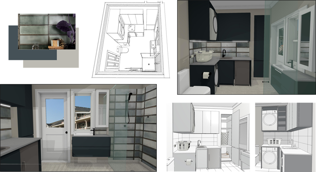
The award finalist laundry design: INSIDESIGN
The results for the laundry
The tall recessed cabinet has a Perspex cat flap to a litter tray in the bottom section and laundry sorting hampers in the top section. Its dual purpose is essential to keeping the floor area clear of clutter. (Incidentally, the joiner said he had never in 30 years made a cat flap to a joinery before. Glad to be a trend setter here!) Generally the tall wall cabinets take full advantage of the room height and offer plenty of storage.
The client fell in love with the industrial looking Diesel tiles on the first sight. They refer to the history of the area and the nearby heritage industrial site. The tiler did amazing job cutting the offset edged tiles in varying widths to line them up in the splashback and shower perfectly. Finally, deep teal colour of cabinets and the muddy grey on the walls compliment the tiles.
The resulting laundry is funky, stylish and practical. It fits all the client’s needs and I’m very proud of it. Let’s see if it’s good enough to win the Designer Awards!
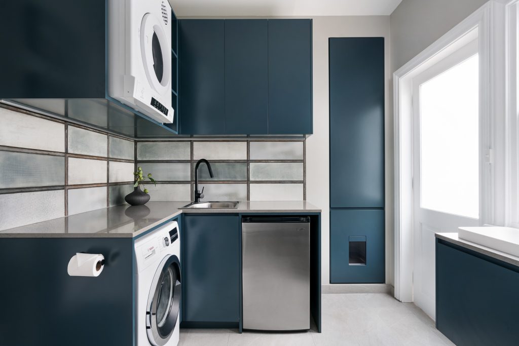
Design: INSIDESIGN – Photo: Rebecca Lu
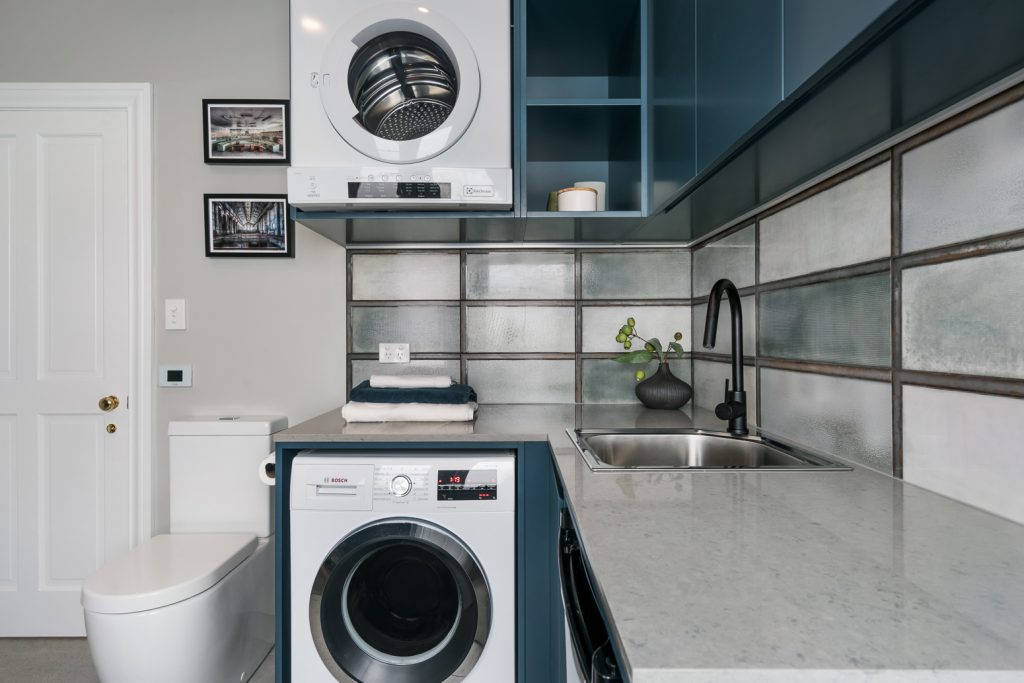
Design: INSIDESIGN – Photo: Rebecca Lu
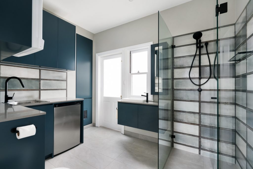
Design: INSIDESIGN – Photo: Rebecca Lu
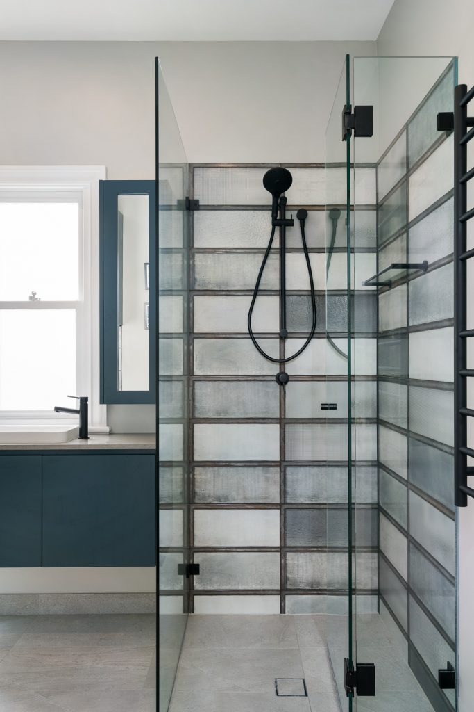
Design: INSIDESIGN – Photo: Rebecca Lu
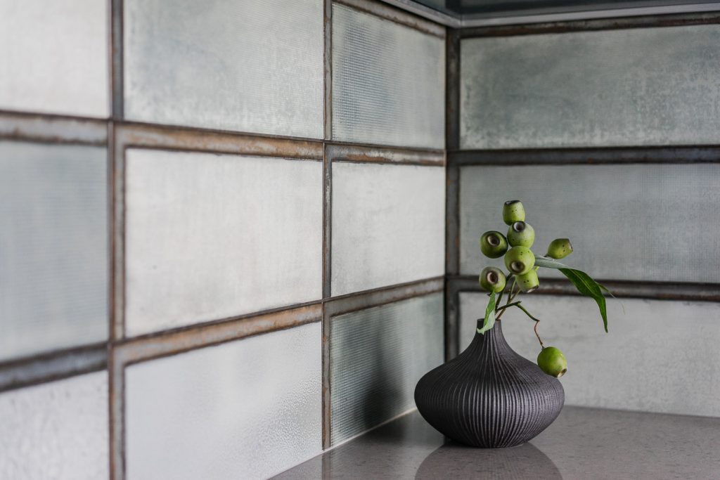
Design: INSIDESIGN – Photo: Rebecca Lu
Now fingers and toes crossed everyone! Year 2020 has some improvements to offer.
Drop me a line if your bathroom needs improvements too!
Stay safe / sane!
Sari

