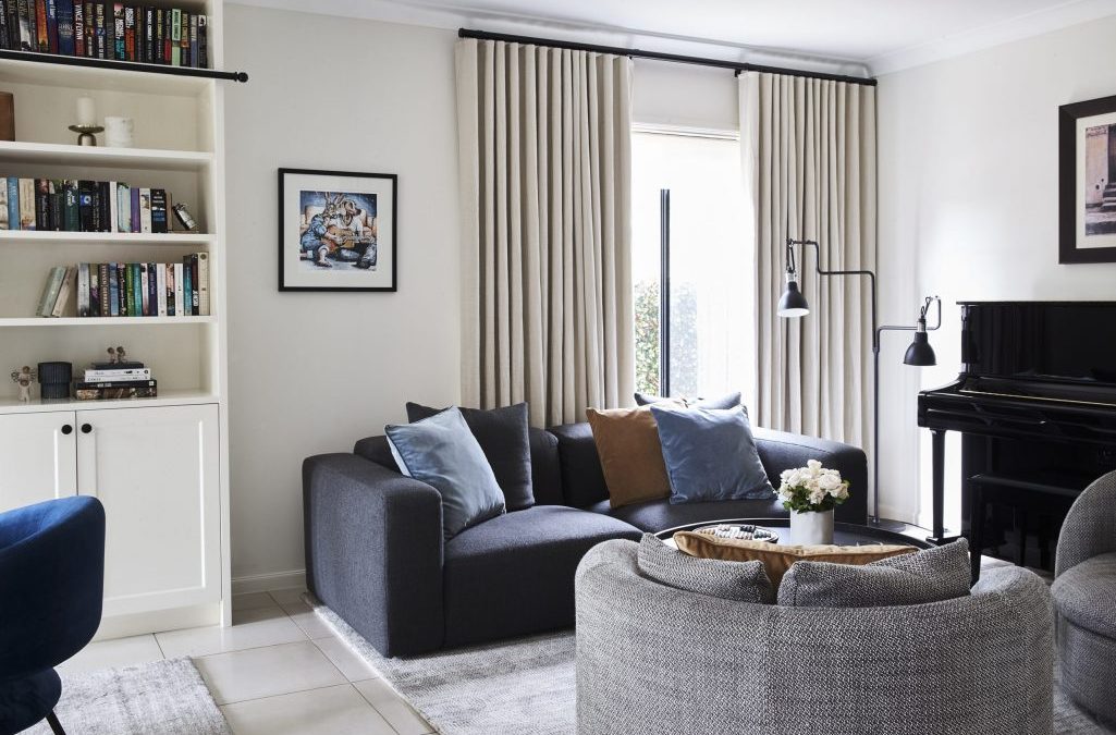
How to define a beautiful colour scheme to any room?
We all have seen pictures with a beautiful painting in a room and the wall paint highlights the pink in it and scatter cushions bring out the blue – or vice versa. The end result looks elegant and curated. And quite the opposite of our dull old living rooms, right?
How can you, my dear reader, achieve the same?
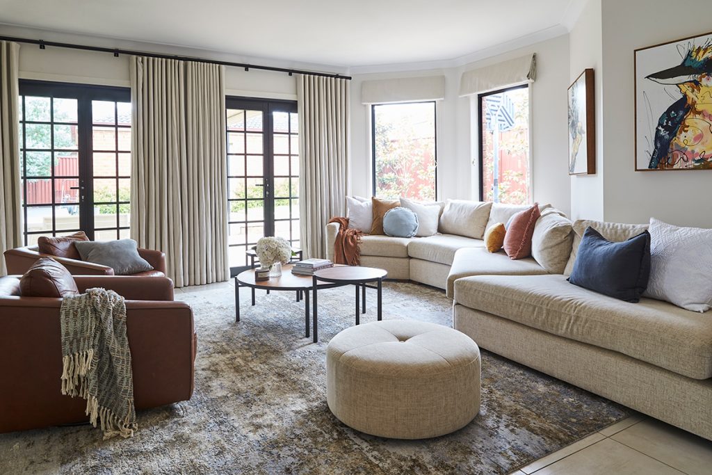
Design: INSIDESIGN – Styling & photo: ESS Creative
There’s two approaches to solve the issue (not mutually exclusive):
- Use a focal point to pick the accent colours from
- Use a colour wheel and common colour schemes to decide the accent colours.
If you’re decorating your rooms, this is not what you should do:
- pick a funky wall colour (or worse: pick the wall colour of your best friend’s lounge)
- paint the room
- go and buy new furniture and
- while you’re at it buy something nice to the walls and a couple of scatter cushions and hope that they all work together.
Unless you’re doing black and white, the chances that it all goes perfectly together are fairly slim.
Why should you not do it that way? First of all, let’s assume your best friend’s lounge faces West and yours to South. You would get completely different kind of light in the room and her paint colour might make your room look cold or odd – different anyway. Also, your floor materials might not go with the hue she chose. Paints should be selected for a certain space with its unique lighting conditions.
And secondly: the result will be better if you do it the other way round. Choose the focal point first before you start painting the walls. The wall paint colour is left to last because there are more options to choose from. It’s easier to find a wall paint colour to match a painting or to upholster furniture in a selected fabric colour, than to find a painting with a certain colour scheme.
1. Picking the colours from a focal point
First you choose your focal point, the item that you want to use as the basis of the colour scheme. It could be a nice rug, or wallpaper, or it could be a piece of art as in the pictures above and below.
Then, you pick your colour(s) from the focal point, accentuate it with other colours and use them in the room. See, like here:
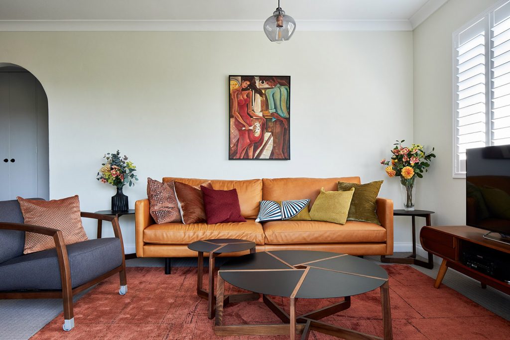
Design: INSIDESIGN – Photo: Conor Quinn
… But how to match the colour of your focal point?
There are many ways to match a colour of a painting: the old-fashioned way requires a trip to the hardware or fabric store: just pick all the blue paint chips and/or fabric samples you can carry and compare them to the painting. The plus: you can get a more accurate match (if you’re lucky). Definitely you will get a good overall view on how the colour samples go with the painting. The minus: you might need to pick up a *lot* of samples to find the exact colour and the painting would have a gazillion different shades and tints to match anyway.
The modern method to match a colour uses a software to do the same. Most paint companies do their version of the same software. The plus: you can do it at home. The minus: the results depends on the accuracy of the photograph of your art piece and the screen distorts colours anyway. And each pixel might have a different tone. You would need to double-check the results with the paint sample before using them.

Photo: Design Seeds
2. How to choose the colour scheme using the colour wheel?
A good explanation of the colour wheel, primary/secondary colours, tints, tones and shades is for example here.
A short version if you wish: hue is the pure colour, tone is the colour mixed with grey, shade is the colour mixed with black to make it darker and tint is the colour mixed with white to make it lighter.
Commonly used colour schemes are:
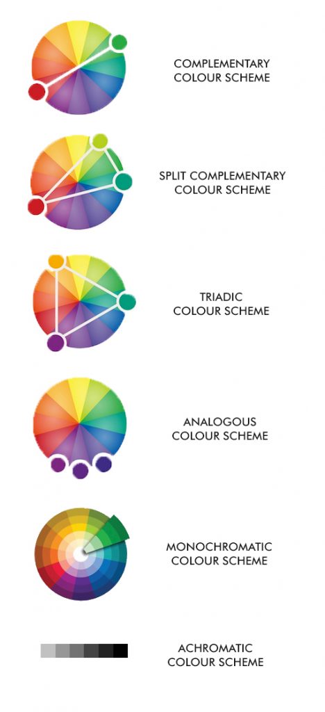
Picture: modified from here
- COMPLEMENTARY SCHEME: the shade, tint or tone of one colour and the colour opposite it, like red and green.
- SPLIT COMPLEMENTARY SCHEME: the colours on both sides of the complementary, like red and blue-green (teal) and yellow-green (lime)
- TRIADIC SCHEME: the three colours are equal distance away from each other on the colour wheel, like yellow-orange and red-purple and blue-green
- ANALOGOUS / RELATED COLOUR SCHEME: three or more colours next to each other, like red and red-purple and red-orange.
- MONOCHROMATIC / ONE COLOUR SCHEME: use different tints, shades and tones of one colour only
- ACHROMATIC / NO-COLOUR SCHEME: only white, grey and black with different tints and shades, usually combined with different textures.
3. How to use the chosen colour scheme in your room?
Once you have picked your colours from the focal point or colour wheel use them to choose colours for furniture and accessories in your room. Generally the rule 60-30-10 is recommended: the main colour is used in 60% of the space, the complimentary colour is used in 30% of the space and the little accent colour is used just scattered here and there to bring in some interest.
You could for example use neutral colours for furniture and walls, the main colour 1 for rug and curtains and colours 2 and 3 for cushions.
Or, use the colour 1 for walls, colour 2 for rug, curtains and cushions and colour 3 for more cushions and accessories.
For example in the picture below the main colour is blue, as in the painting, cushions and rug. The second colour is black, in the sofa. The third colour is yellow, which is used in just small splashes in the art work and accessories.
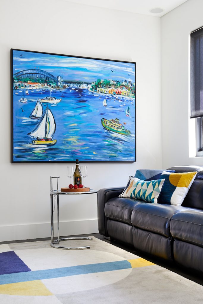
Photo: Conor Quinn
Colours can have a big impact on your mood so choose well. Here is a very thorough explanation of colour psychology from brands and marketing perspective but it applies to decor too. Take advantage of the colour psychology and you can easily create different schemes for different seasons by just small changes.
Contact me if you’d like any help with your colours!
Have a lovely day!
Sari

