

How to style rooms to impress
a.ka. the secrets of Interior Decorators exposed!
We’ll all be out of job now!
… not really. It’s just basic stuff based on the classic interior decoration principles. How to get the best out of your current furniture and accessories? How to create harmonious and pleasant interiors with cool focal points?
Just like this. Just follow these rules and test it at home.
Proportion and scale
Place your items in a space where their relative dimensions appear to be right. You don’t usually want to feel like Alice in Wonderland at home. A very large grandfather’s chair needs a large space around it to look hip. Crammed in a corner next to a tiny table it looks overwhelming. A very small vase in a high bookcase would just get lost in the space by itself. Two-seater sofa in a large living room is a waste of space and makes the room uninviting. The list goes on.
Sometimes, of course, you would break the rule just to create interest in your deco. Just do it deliberately.
Space Furniture stand at the Denfair – Photo: INSIDESIGN
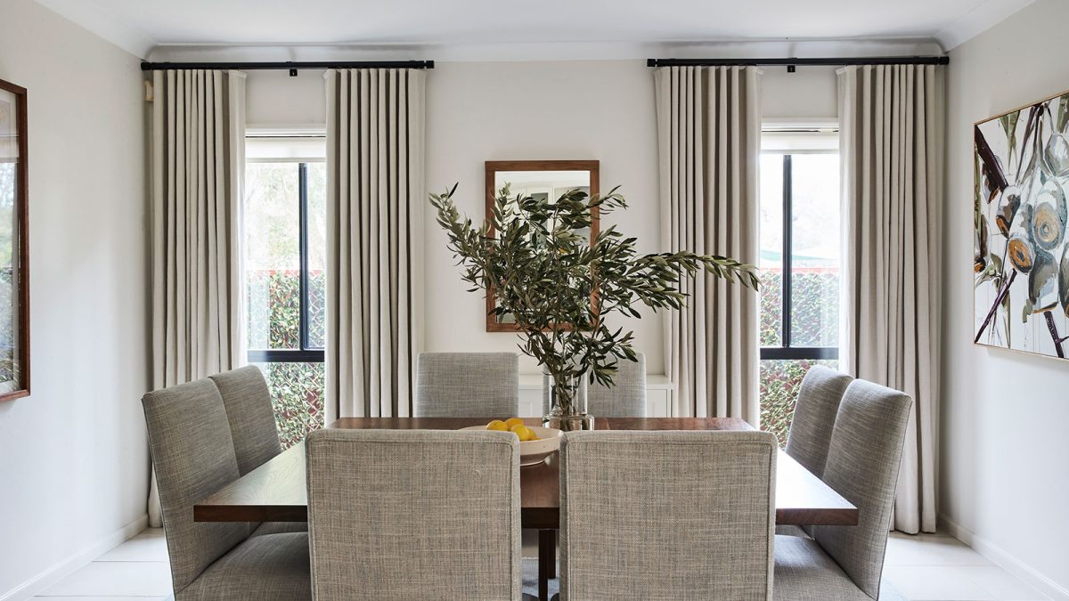
Visual balance – symmetric, asymmetric or radial balance
Symmetric
If you like more formal style deco and a bit of classic grandeur, but would like to inject personality to your room, aim for symmetry. With symmetric arrangement of your furniture – say sofas on both sides of the fireplace – you can draw the focus to your gorgeous art work on top of a mantelpiece for maximum attention and balance. Or arrange the same size and visually similar art prints in a straight grid on the wall.
Personally I think (and perhaps I shouldn’t say this) too much symmetry will make the space bland and boring – you need to break it with something. If you do go for full symmetry, make sure your focal points – the items you draw attention to – are interesting.
Chairs and side tables are positioned symmetrically around the fireplace. Design: INSIDESIGN – Photo: Rebecca Lu Photography
Asymmetric
If, however, you like to have drama in your décor, create optical balance by placing pieces asymmetrically.
Here’s how you do it: size impacts the the visual weight of an item, but not alone. Decorative pieces that are weird shapes (typical example: plants and flowers), in bright or dark colours, have contrasting textures in them or have very elaborate details have more visual weight than lighter, paler, smoother objects.
Heavy items should be balanced with visually lighter objects which are clearly larger, more numerous or further away to compensate.
Light colour
Simple / no texture
Plain / no details
One item
Far away
Bright or dark colour
Textured
Intricate details
Many items
Near each other
See an example below: the items looks balanced with the large, light coloured, textured basket with a large plant far away from the group of round timber plates.
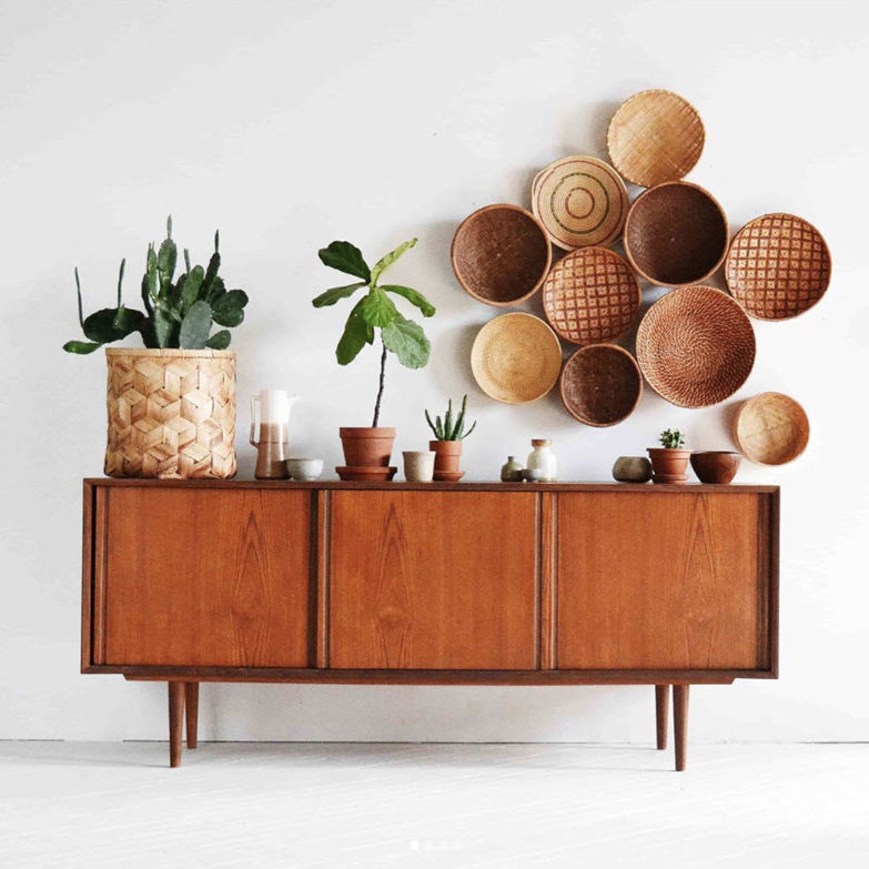
Photo: Cadence Hays via The Local Project Instagram
If you have a small item which is unusually textured or bright colour, you would need a bigger item of a calmer colour to balance it. If you have a very large colourful painting, you would need a group of smaller, darker, brighter and different shapes of items to balance it. That is why sometimes a vase, painting or another decorative item just looks wrong by itself, but when grouped with something completely contrasting size it just looks right.
For instance, instead of placing same size and colourway artworks in a grid on the wall, group artworks that are larger and lighter with some that are smaller, but darker or brighter, and place them asymmetrically. Like a gallery wall.
Radial balance
The third form of visual balance is radial balance. You would achieve it by placing similar objects in a circle, like an interesting round table surrounded by more neutral chairs or vice versa. All cool pictures of this kind of setup have either a large vase of flowers or a beautiful pendant light (or both) in the focal point, the middle of the table.
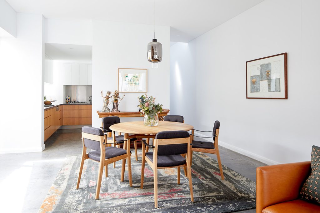
Table with decoration in the radial focal point. Design: INSIDESIGN – Photo: Conor Quinn Photography
Harmony
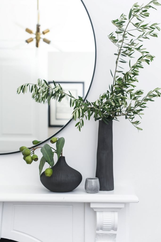
You can create harmony by using items that have something in common with them. It may be similar material (for example wood), similar colours in your colour palette, common size or shape or details that are carried through.
Harmony’s best friend is variety and they go very much hand in hand. An interior decorator would aim for harmony and unity, but too much of the same-same would make the place boring. Hence you add variety. On the other hand too much of variety would make you lose harmony and look like the decorator never showed up. And so forth. Again – create interest in a clever way!
You can introduce variety subtly by for example by varying the size of your objects but keeping the tone, material or shape constant. Or the opposite.
See the examples below:
 Design: INSIDESIGN – Styling: Domi Interiors – Photo: Inward Outward
 Similar material and colour, but varying sizes creates a beautiful vignette.
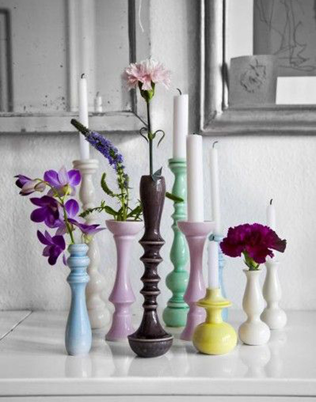 Photo via Pinterest
Or use different colours in the similar but-not-quite-the-same shaped items.
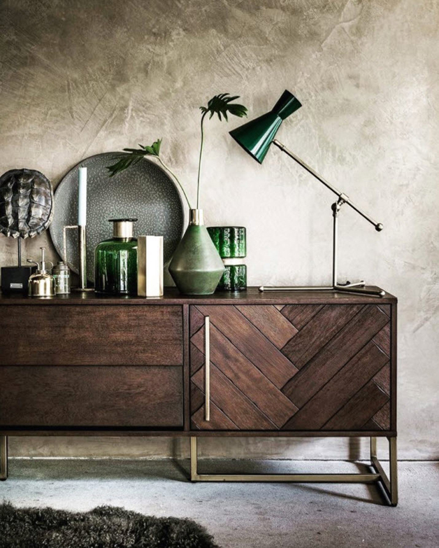 Photo: @vtwonen via Instagram
This beautiful sideboard styling has the same green colour and gold material carried through in completely different shapes. Looks stunning.
 Design: INSIDESIGN – Styling: Domi Interiors – Photo: Inward Outward
If your items really have nothing in common, then try grouping them – refer back to the chapter about Balance. It was very hard to find a picture of such styling though – even this one repeats colours, sizes, shapes and materials.
Rhythm
Repeating similar lines, textures or shapes creates rhythm – movement – and it’s a very powerful way to create unity and interest in your décor. With repetition you can lead the viewer’s eye to go where you want it to go and you can cheat our brains with it. Think about a stripy wallpaper: horizontal stripes would make the wall look wider, vertical stripes would make it narrower and higher, irregular stripes would create a more complex rhythm. Rhythm will also help you create layers to your décor, you can use it to group furniture for example.
Sometimes rhythm needs variation. Slight changes in tone, details or for example size will add interest to your rhythm.
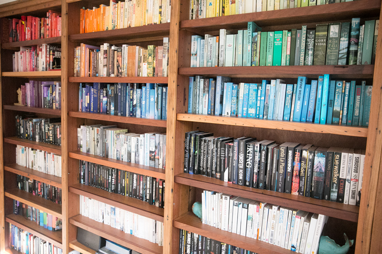
A typical rhythm found in most homes is the bookcase: repetition of horizontal lines for shelves, vertical lines for books. Photo: INSIDESIGN
Emphasis
If everything in your décor is of same size, shape or colour, it would easily become very monotonous. Nothing pops up and there’s no interest. Instead, choose the most important feature from your room and highlight it – give it visual emphasis. You can make the items shine with a contrasting colour, texture, shape, using clever lighting or their placement in a focal point.
A word of warning: too much emphasis means there’s no one focal point, i.e. no emphasis. It’s just loud. And if you have many competing focal points of different kinds, you would lose the harmony and unity.
Consider this too
When you decorate your house you would take these design principles into account on many different levels when styling your home:
- On macro level, to create unity and harmony across the whole house – you could do that with a consistent style across all rooms, on the selection of materials or a uniform colour palette. (Remember variety!)
- On a room level, for example when considering scale, proportion and balance of your furniture or the harmony of your colour palette.
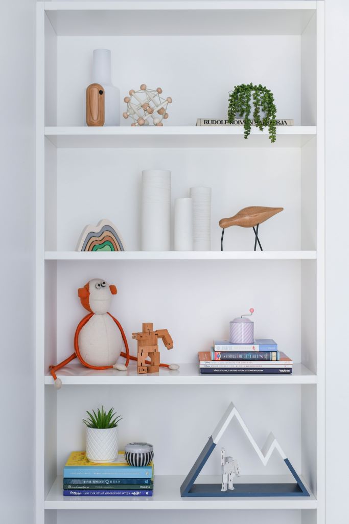
- On a detailed level, when creating little vignettes, for example accessorising a side board, bookcase or mantelpiece. You would group and repeat your decorative objects considering their proportion, scale, balance, materials, colours etc.
And last little hint: repeat or group objects in odd numbers. Usually odd numbers are more pleasing to the eye than even numbers of items. Always go for the magic three.
PS. If nothing else works, add a lot of fresh flowers!
I’m happy to help with your interior decoration dilemmas – drop me an email and we’ll work it through together!
Have fun decorating!
Sari